Story Ideas: Ten Influencers Who Shaped the Science of Interactive Infographics
Prompt
I would like to inspire my students in the course with a few stories about people who led the science of the visual display of information leading up to interactive infographics. People like Edward Tufte and Steven Few. Please generate list of the 10 top influencers in the lead up to the science of interactive infographics.
Dan, since you are building a course around Interactive Infographics, it’s powerful to show students that this field didn’t suddenly appear with JavaScript libraries like D3 or Plotly. It evolved over 200 years of thinking about how humans understand information visually.
Below is a curated list of 10 major influencers who helped create the intellectual foundation that eventually led to interactive infographics and modern data visualization systems.
I ordered them roughly chronologically by influence on the field so students can see the progression.
1. William Playfair (1759–1823)
Inventor of the modern statistical chart
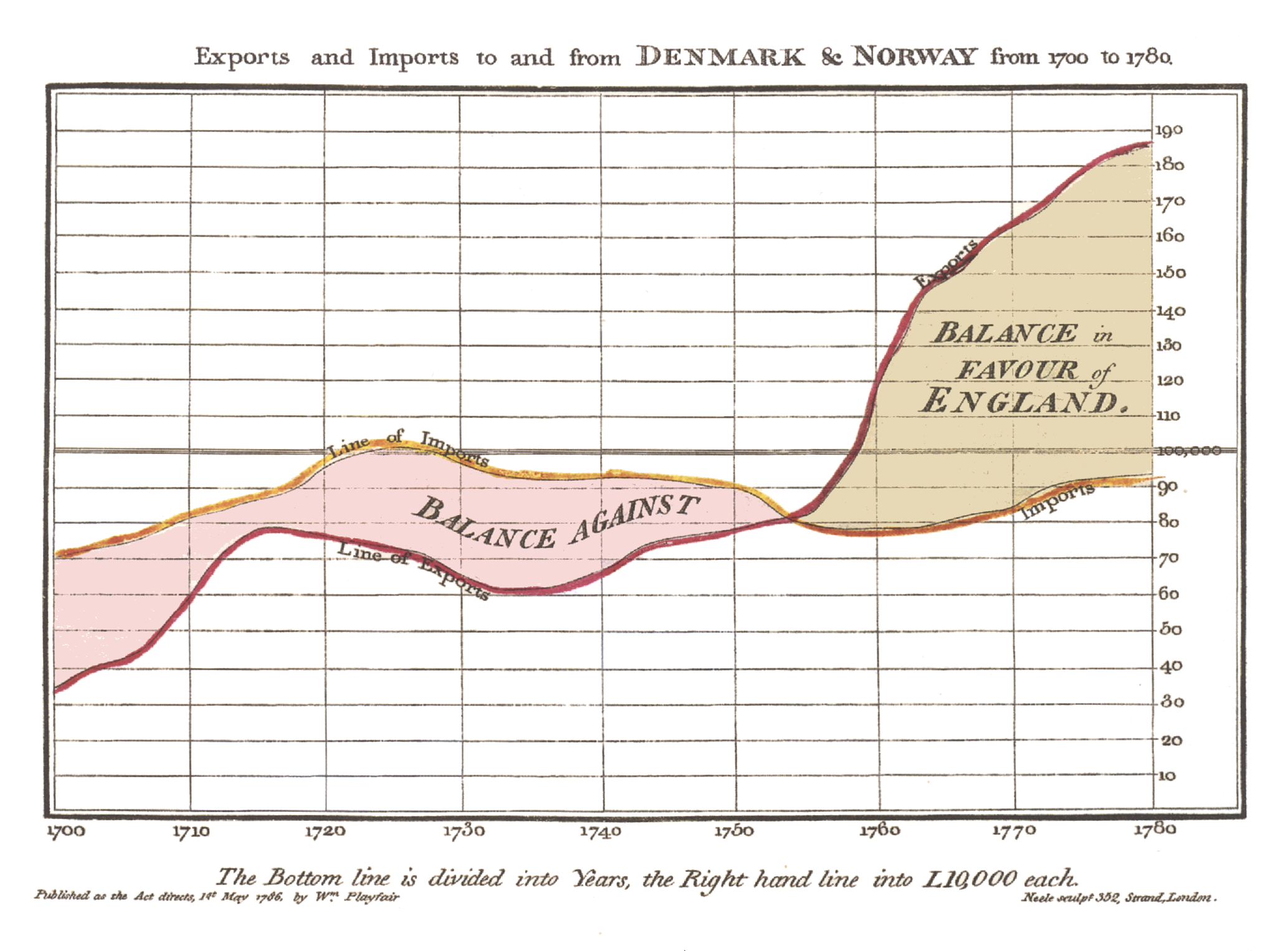
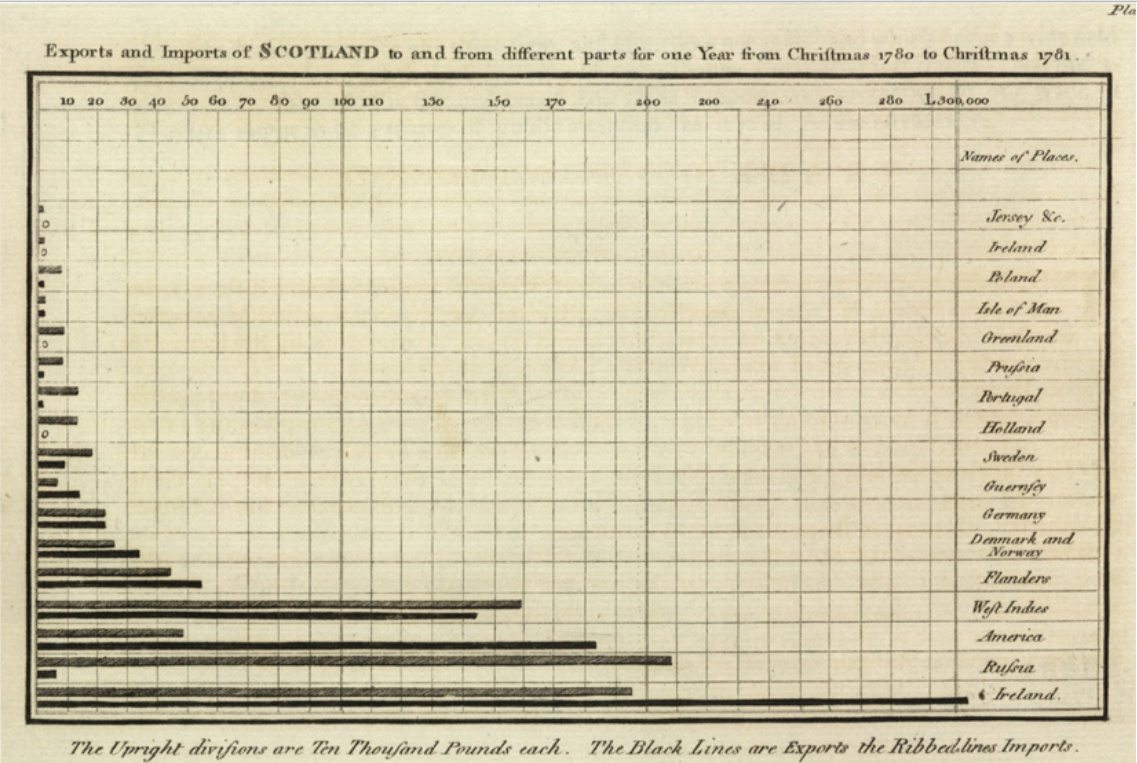
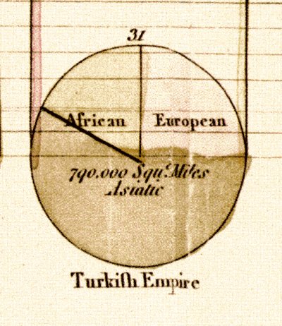

Playfair essentially invented graphical statistics.
He introduced:
- Line charts
- Bar charts
- Pie charts
Before Playfair, data was mostly shown in tables of numbers.
His insight was revolutionary:
The human eye can see patterns in shapes faster than in numbers.
This idea is the philosophical starting point of all data visualization.
2. Florence Nightingale (1820–1910)
Used visual data to change public policy

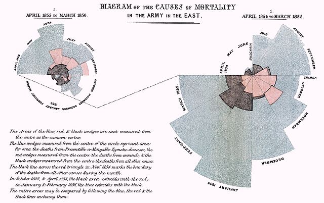
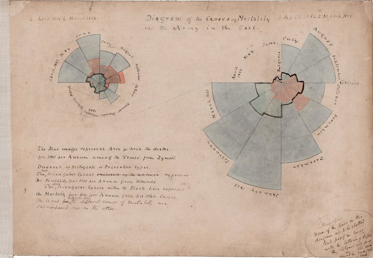

Nightingale created one of the most famous early infographics: the Coxcomb diagram.
It showed that most deaths in the Crimean War came from disease, not battle.
Her work demonstrated something critical:
Visualizations can change government policy.
This idea still drives modern interactive dashboards used in:
- public health
- epidemiology
- government transparency
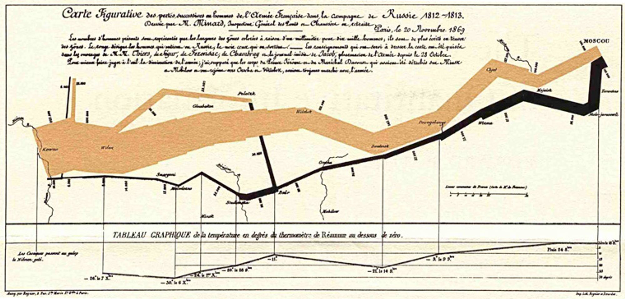
3. Charles Joseph Minard (1781–1870)
Creator of the most famous infographic ever

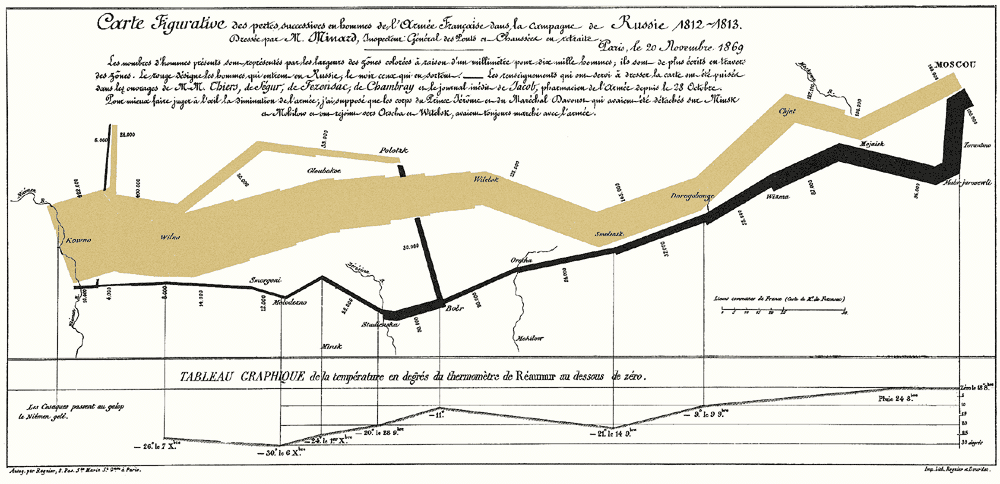
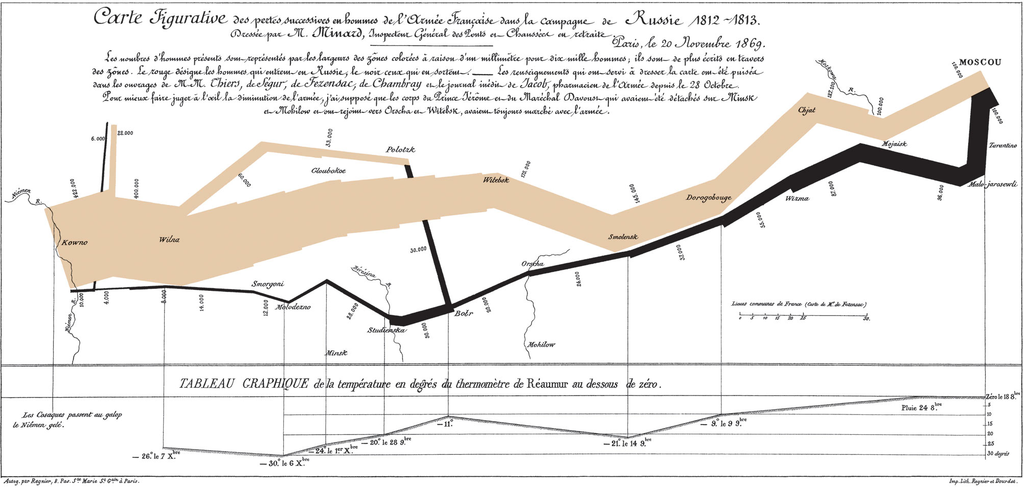

Minard’s Napoleon’s March to Moscow (1869) visualization is widely considered the greatest statistical graphic ever produced.
In a single image it shows:
- Army size
- Geography
- Direction of travel
- Temperature
- Timeline
Five variables in one coherent story.
Edward Tufte famously called it:
"The best statistical graphic ever drawn."
4. Jacques Bertin (1918–2010)
The father of visual encoding theory
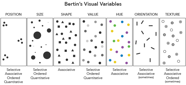


Bertin wrote the groundbreaking book:
Semiology of Graphics (1967)
He formalized how visual elements encode information.
He identified visual variables such as:
- position
- size
- color
- shape
- orientation
- texture
Modern visualization libraries like D3, Vega, and Tableau rely on these ideas.
5. John Tukey (1915–2000)
Inventor of exploratory data analysis
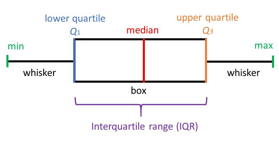


Tukey introduced the idea that visualization is essential for exploring data, not just presenting results.
He invented:
- Box plots
- Stem-and-leaf plots
His philosophy:
Look at the data first. Let patterns reveal themselves.
This concept is central to interactive analytics tools today.
6. Edward Tufte (b. 1942)
Champion of clear, information-dense graphics

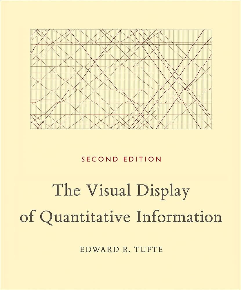
Tufte popularized information design as a discipline.
His books became classics:
- The Visual Display of Quantitative Information
- Envisioning Information
- Beautiful Evidence
Key ideas:
- Data-ink ratio
- Remove chartjunk
- Show high data density
He influenced an entire generation of visualization designers.
7. Ben Shneiderman (b. 1947)
Pioneer of interactive visualization
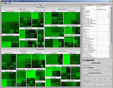
Shneiderman helped move visualization from static graphics to interactive exploration.
He invented the Treemap visualization.
His famous rule for interactive visual analytics:
Overview first Zoom and filter Details on demand
This mantra is still used in modern interactive dashboards.
8. Hans Rosling (1948–2017)
Showed the world the power of animated data
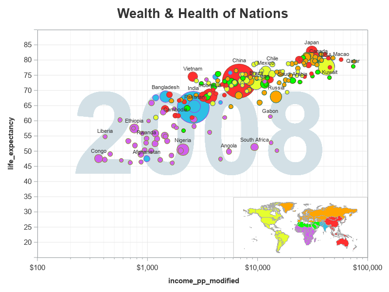
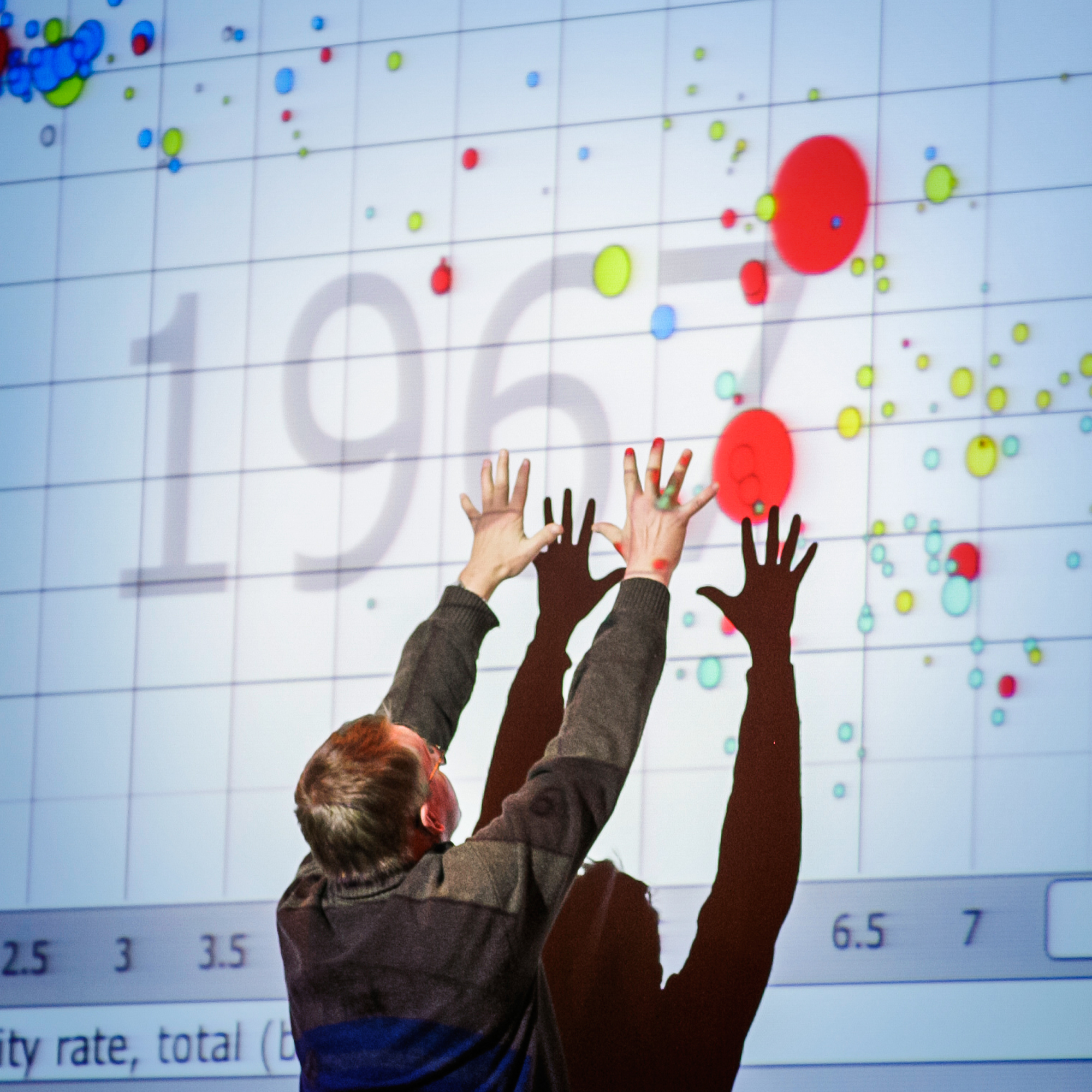


Rosling transformed public understanding of global development using animated data visualizations.
His Gapminder tool showed trends in:
- income
- life expectancy
- population
His TED talks made millions of people realize that data can tell powerful stories visually.
9. Stephen Few (b. 1956)
Leader in dashboard design

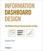


Few is one of the world’s leading experts on business dashboards.
He introduced the bullet chart, a compact alternative to gauges.
His work focuses on:
- decision-support dashboards
- effective business visualization
- perceptual accuracy
10. Mike Bostock (b. 1980)
Creator of the modern interactive visualization toolkit
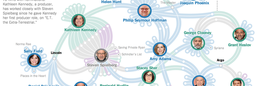


Bostock created D3.js, which revolutionized interactive data visualization.
D3 allows developers to bind data directly to visual elements in the browser.
Many modern interactive infographics use concepts from D3.
It effectively turned the web into a platform for data-driven graphics.
The Evolution Toward Interactive Infographics
A simple way to present the story to students:
| Era | Key Idea | Influencers |
|---|---|---|
| 1800s | Charts invented | Playfair |
| 1850s | Visualization persuades policy | Nightingale |
| 1860s | Complex storytelling graphics | Minard |
| 1960s | Visual encoding theory | Bertin |
| 1970s | Exploratory data analysis | Tukey |
| 1980s–1990s | Information design principles | Tufte |
| 1990s | Interactive visualization | Shneiderman |
| 2000s | Animated storytelling | Rosling |
| 2000s–2010s | Dashboard design | Few |
| 2010s+ | Web-based interactive infographics | Bostock |
💡 A teaching idea for your course
You could open the course with a timeline infographic called:
“200 Years of Visualizing Information”
Then show students how each person contributed one piece of the puzzle that eventually led to interactive infographic textbooks — exactly the kind of work you are building.
If you want, I can also generate a visual timeline infographic (1600×900) showing these ten pioneers and their contributions. It would work beautifully as the opening slide for your course.