List of MicroSims
MicroSims are small, interactive educational simulations — each one focused on
a single concept. They live under docs/sims/<sim-name>/ and are embedded
into chapters via iframes.
Many AI/strategy MicroSims are shared with other textbooks (such as
Tracking AI). Those live in
the central
shared-microsims repository
and are mounted here as a git submodule at docs/sims/shared/. To edit a
shared sim, change it in the shared-microsims repo (not inside
docs/sims/shared/), then pull the submodule forward.
-
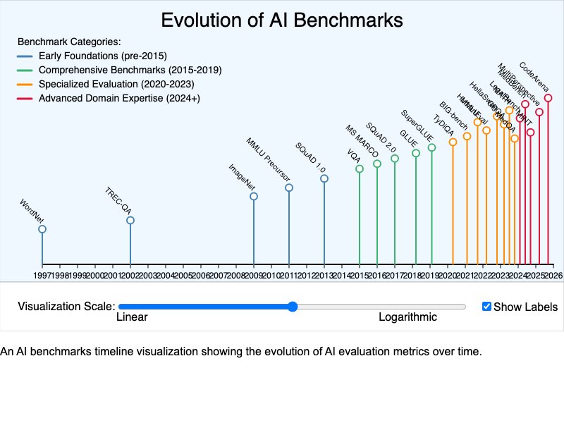
Interactive timeline showing key AI benchmarks and when they were introduced.
-
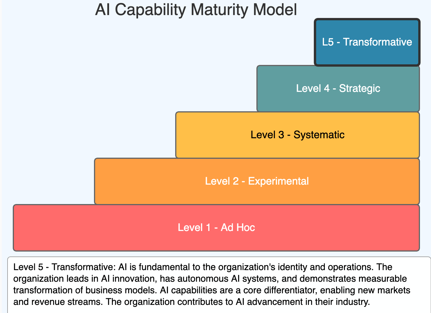
Interactive visualization of five AI maturity levels from Ad Hoc to Transformative.
-
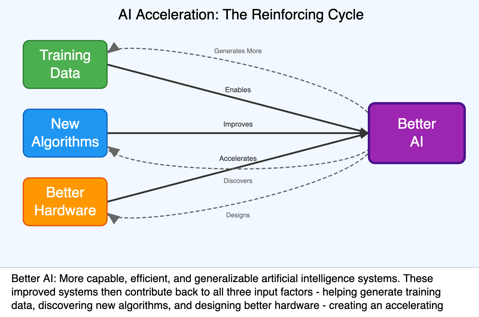
A causal loop diagram showing how AI feedback is accelerating AI progress.
-
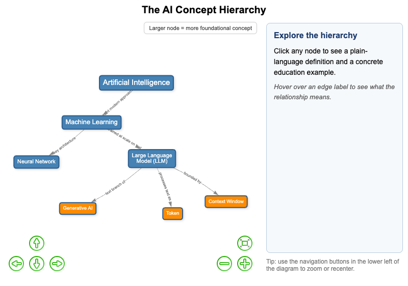
Interactive vis-network concept map showing how AI, machine learning, neural networks, LLMs, generative AI, tokens, and context windows relate to each other.
-
Analysis of AI task completion doubling rate based on METR research.
-
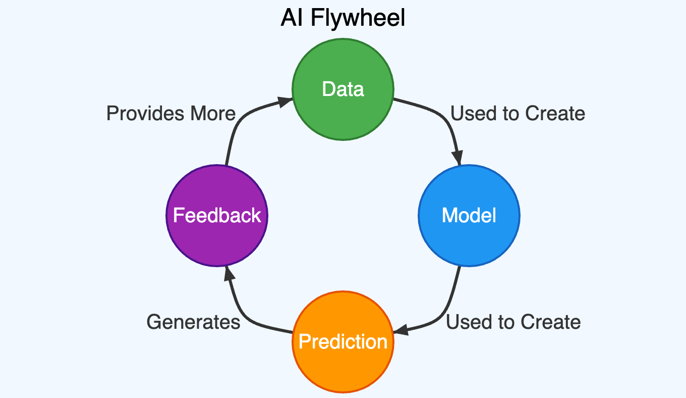
An infographic MicroSim of the AI Flywheel causal loop.
-
AI Governance Structure — Hybrid Model
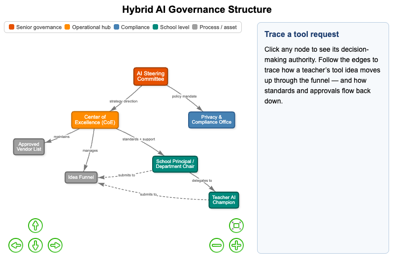
Interactive vis-network diagram of a hybrid AI governance model showing decision authority at each level and how a tool-adoption request moves through the system.
-
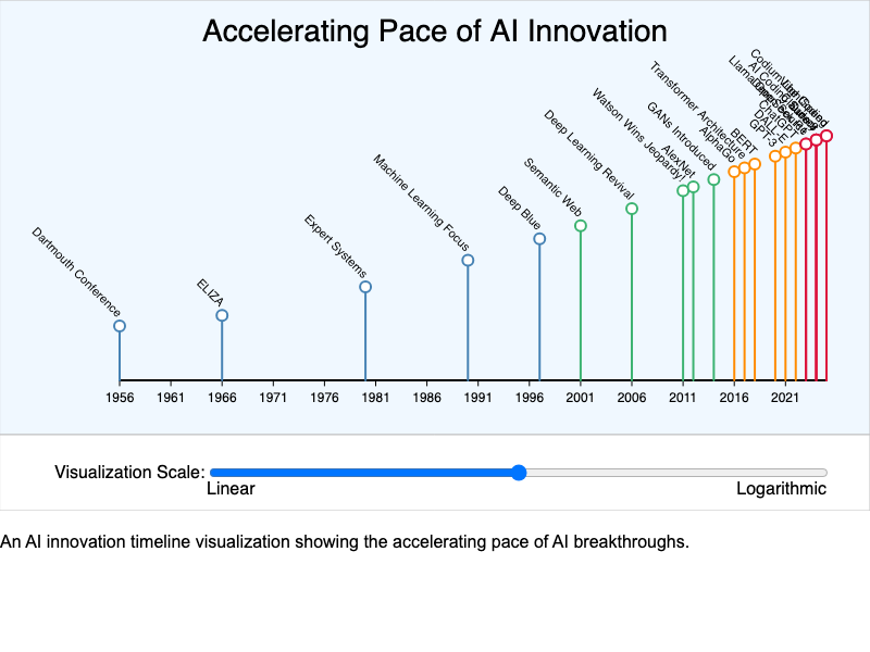
Interactive visualization demonstrating how AI capabilities are accelerating.
-
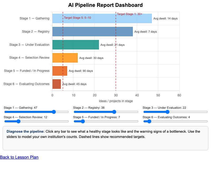
Interactive Chart.js dashboard for interpreting an AI program pipeline report to spot healthy stages and bottlenecks.
-
AI Strategy Implementation Roadmap
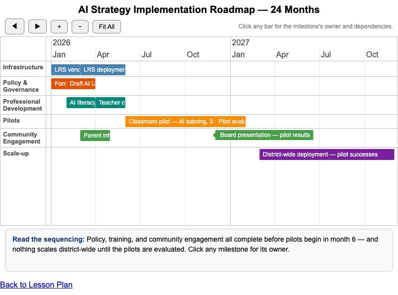
Interactive vis-timeline roadmap for a phased AI strategy implementation showing dependencies, owners, and sequencing logic.
-
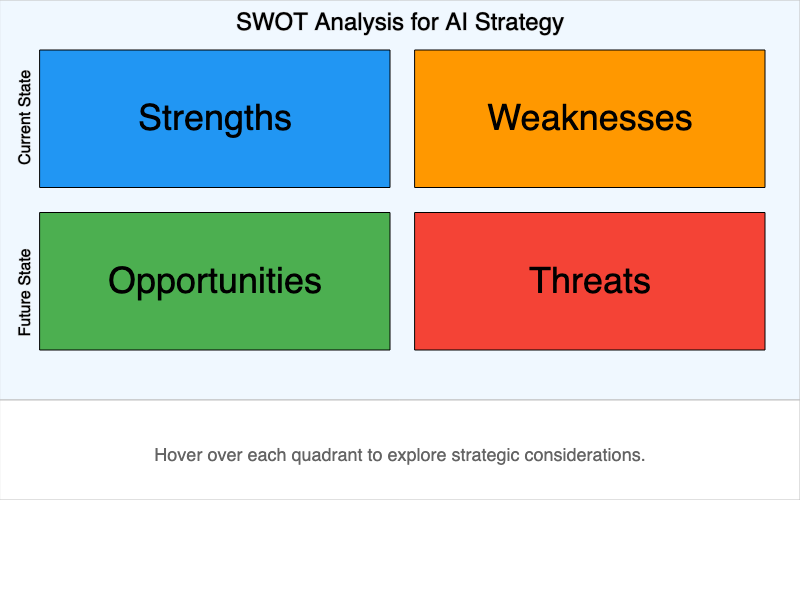
Interactive SWOT analysis diagram for AI strategy development with hover descriptions.
-
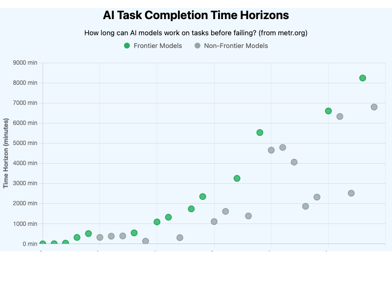
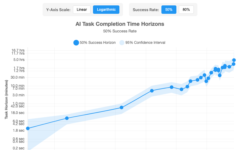
Interactive visualization showing how long AI models can work on tasks based on METR research.
-
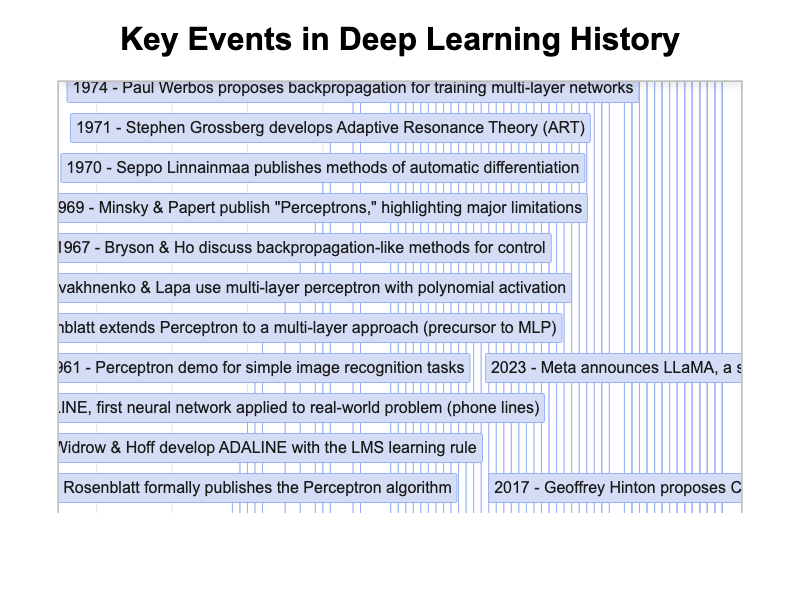
Interactive timeline showing over 100 key events in Deep Learning history from 1935 to present.
-
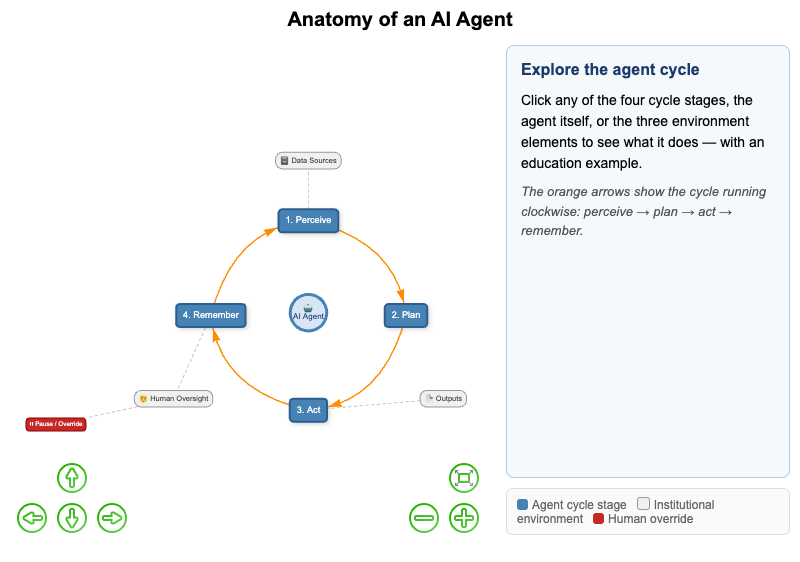
Interactive vis-network diagram showing the core components of an AI agent and how they connect.
-
Anatomy of an Intelligent Textbook
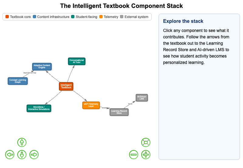
Interactive vis-network diagram of the components of an intelligent textbook and how they work together to personalize learning.
-
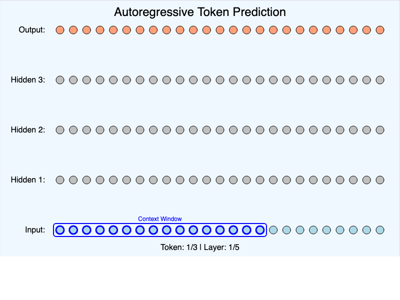
Interactive simulation showing how language models predict the next token using neural networks.
-
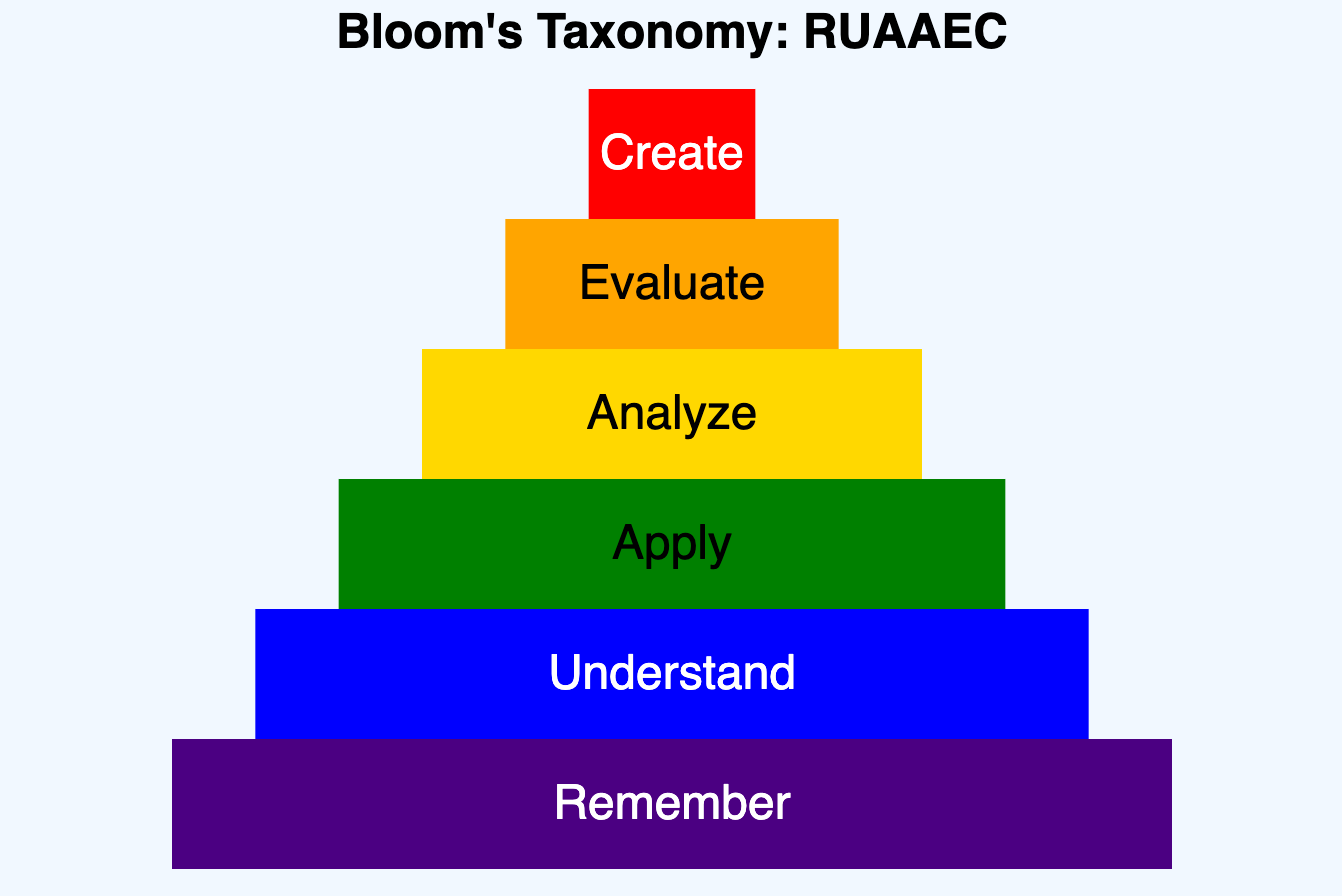
Infographic with infobox hovers showing layers of Bloom's Taxonomy.
-
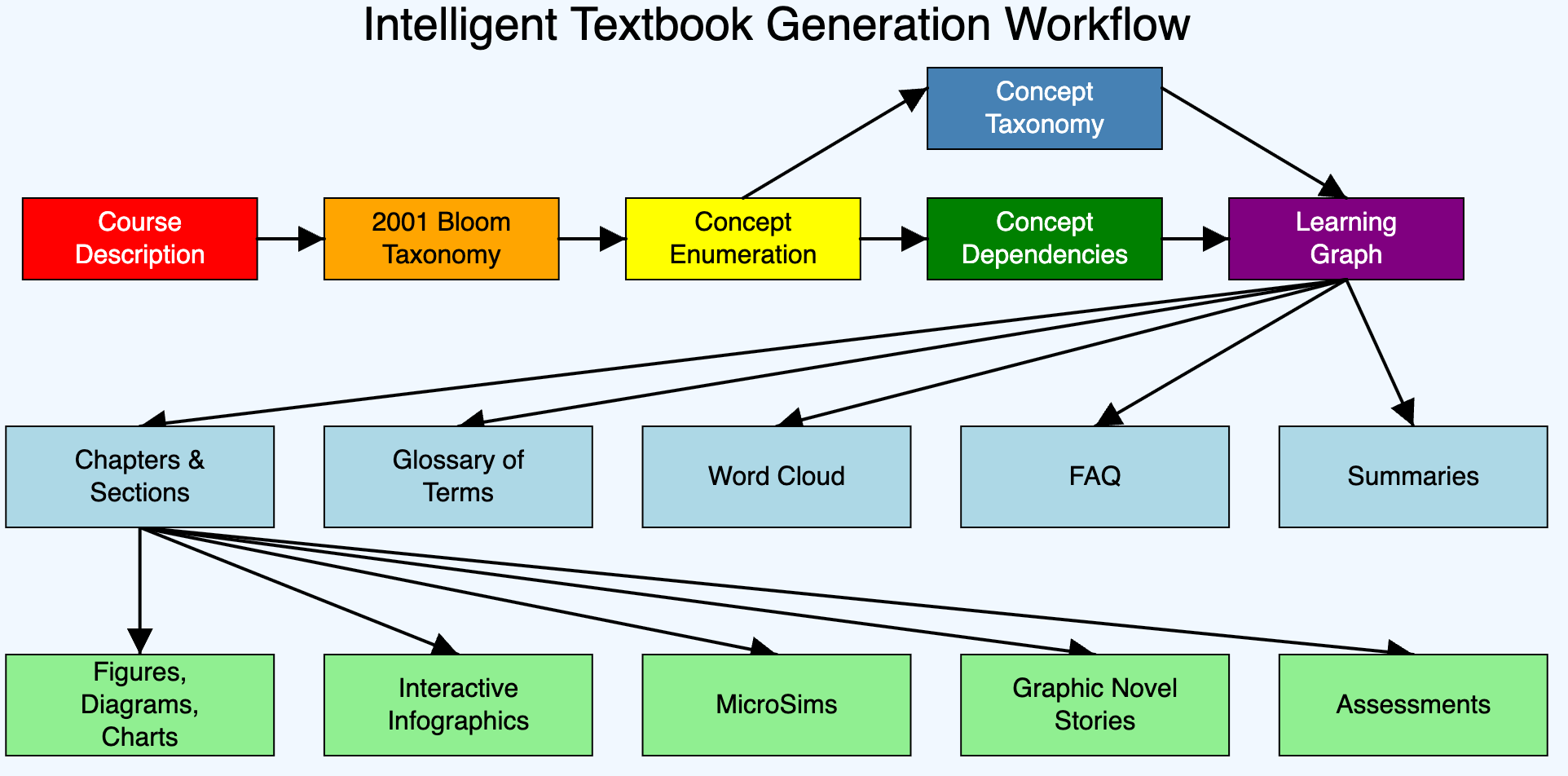
Interactive infographic showing the workflow for generating intelligent textbooks.
-
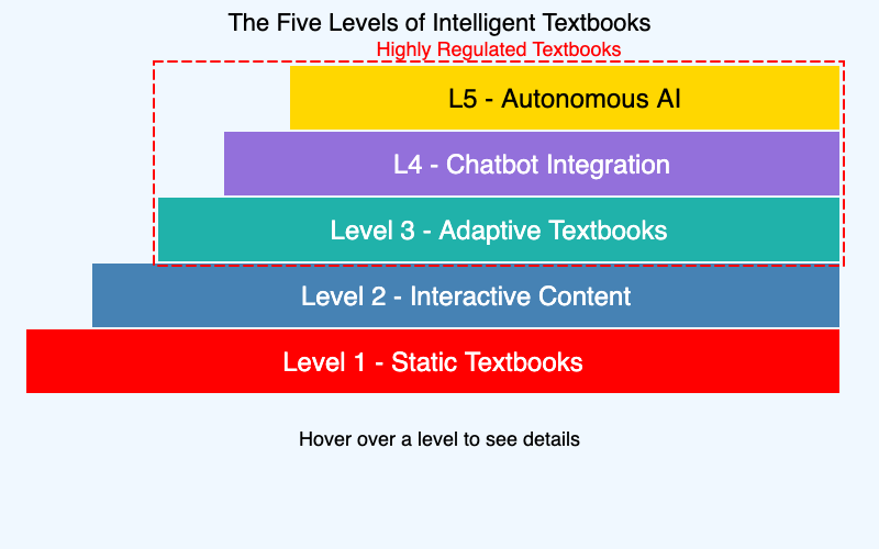
Interactive visualization of five levels of intelligent textbooks from static to AI-driven.
-
Build vs. Buy Decision Framework
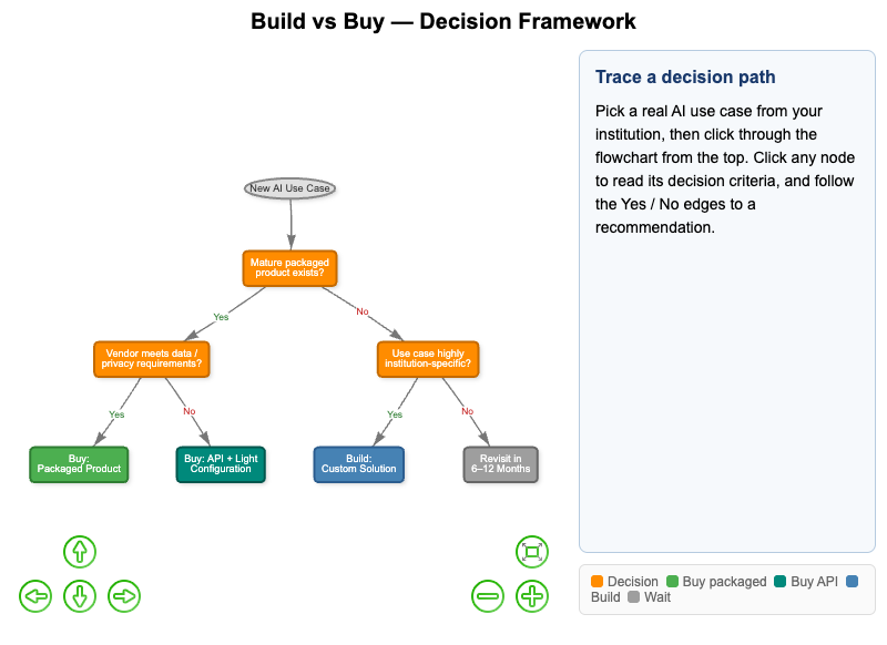
Interactive vis-network decision tree for tracing an AI use case through the build vs. buy framework to a justified recommendation.
-
Center of Excellence Organizational Structure
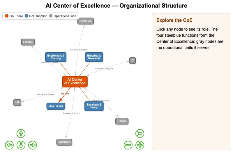
Interactive vis-network org chart of an AI Center of Excellence showing the role of each function and how it relates to the broader institution.
-

A generic vis-network viewer for causal loop diagrams (CLDs). Loads any CLD JSON file in the systems-thinking schema.
-
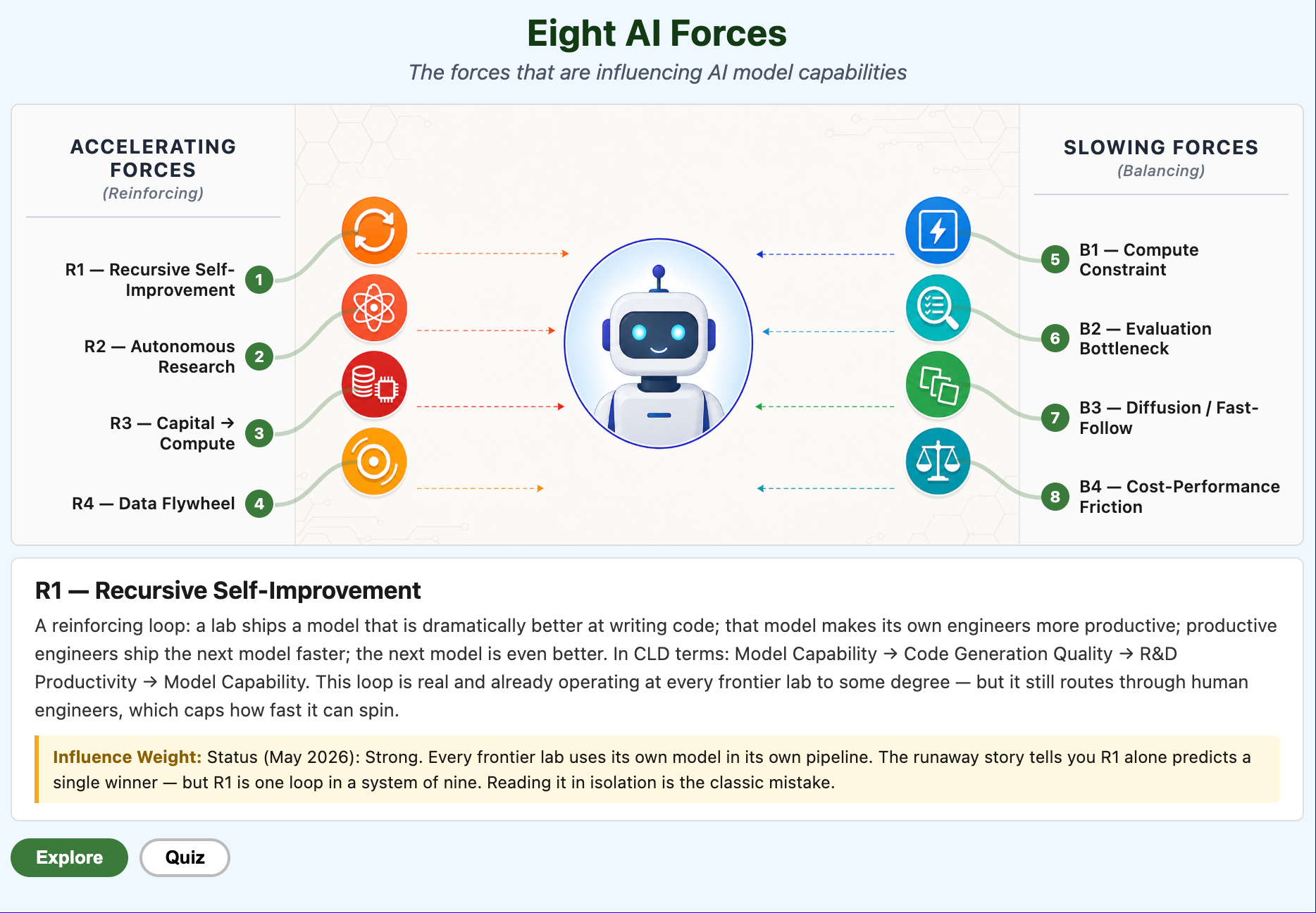
Interactive infographic showing the four reinforcing and four balancing loops that determine whether AI capability runs away or stays in oligopoly.
-
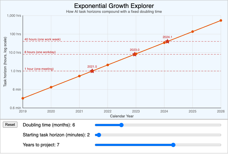
Interactive p5.js explorer with sliders for doubling time and starting value to build intuition for exponential growth over 2-10 year planning horizons.
-
Five Levels of Textbooks Progression
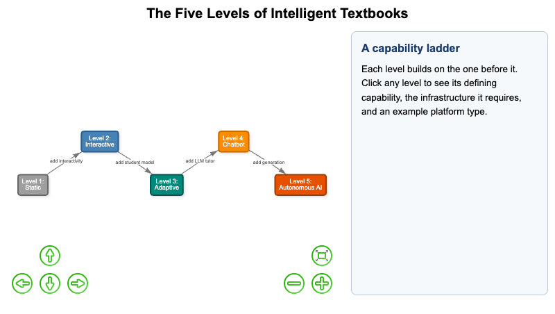
Interactive vis-network diagram of the five levels of textbooks, from static print to AI-driven adaptive, with the defining capability of each level.
-
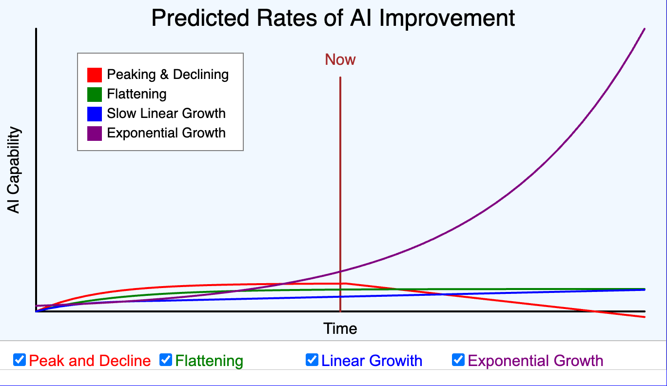
Interactive chart showing four possible scenarios for AI development growth patterns.
-
Gap Analysis — Current State to Target State
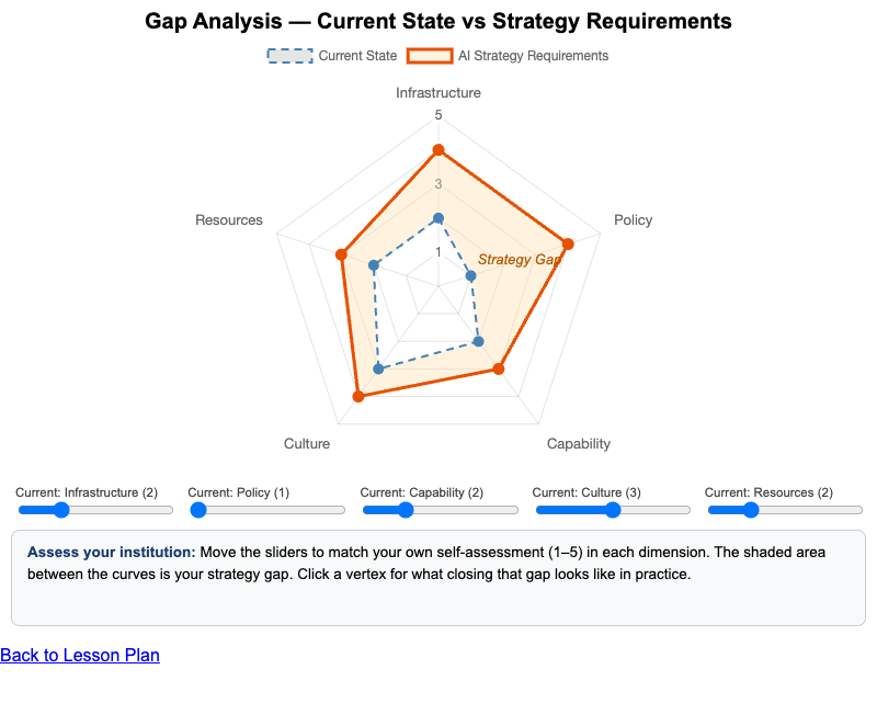
Interactive Chart.js gap analysis comparing an institution's current capability to AI strategy requirements across key dimensions.
-
An interactive infographic showing the steps in managing a GenAI Center of Excellence.
-
How Retrieval-Augmented Generation Works
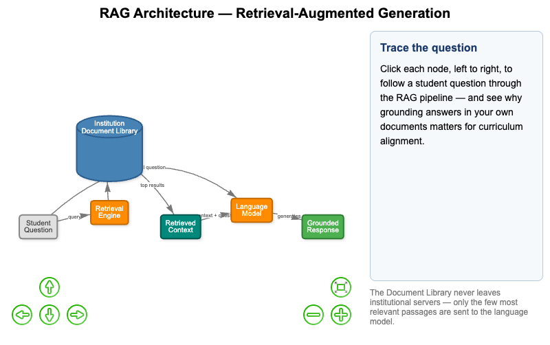
Interactive vis-network diagram tracing a student question through a retrieval-augmented generation system and why private document grounding matters.
-
Interactive Idea Scoring Rubric
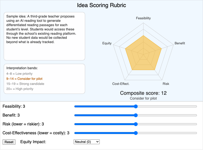
Interactive p5.js rubric for scoring GenAI project ideas across five dimensions and calculating a composite score.
-
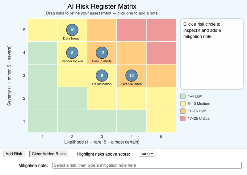
Interactive p5.js risk register for plotting institutional AI risks on a likelihood-impact matrix and spotting which need urgent mitigation.
-
Learning Graph Taxonomy Structure
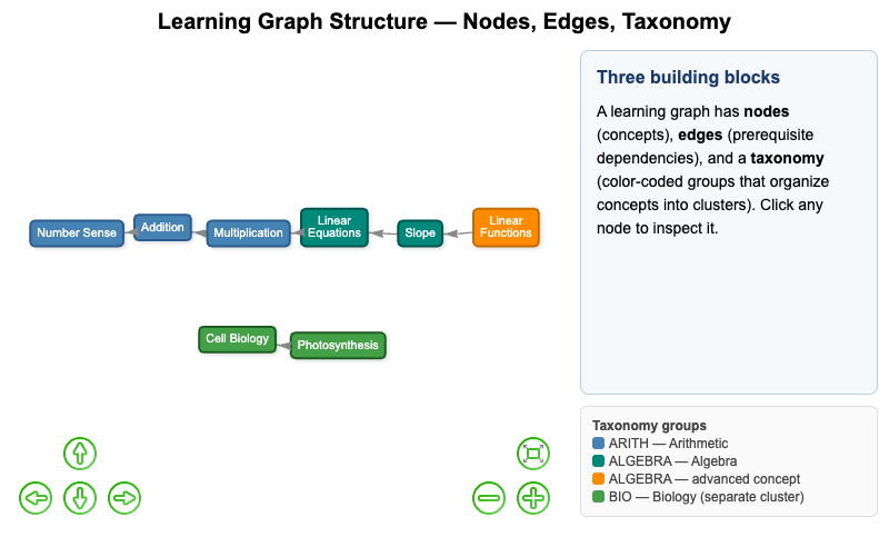
Interactive vis-network diagram of learning graph structure — nodes, edges, and taxonomy — showing how taxonomy groups organize concept clusters.
-
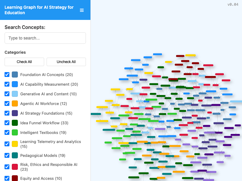
Interactive vis-network viewer for exploring the course learning graph with concept search, category filtering, pan/zoom navigation, and live statistics.
-
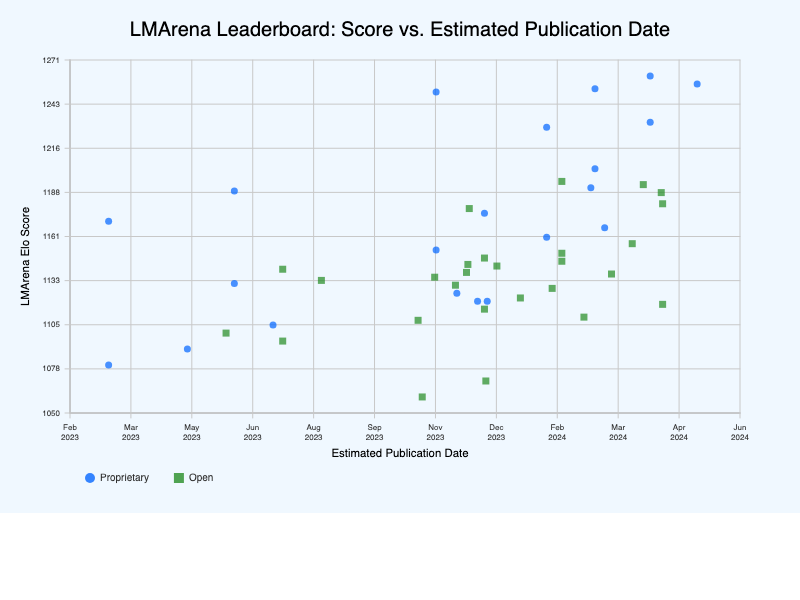
Interactive visualization of LMArena benchmark rankings for AI models.
-
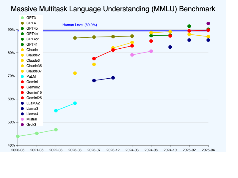
Interactive visualization showing AI model progress on the MMLU benchmark.
-
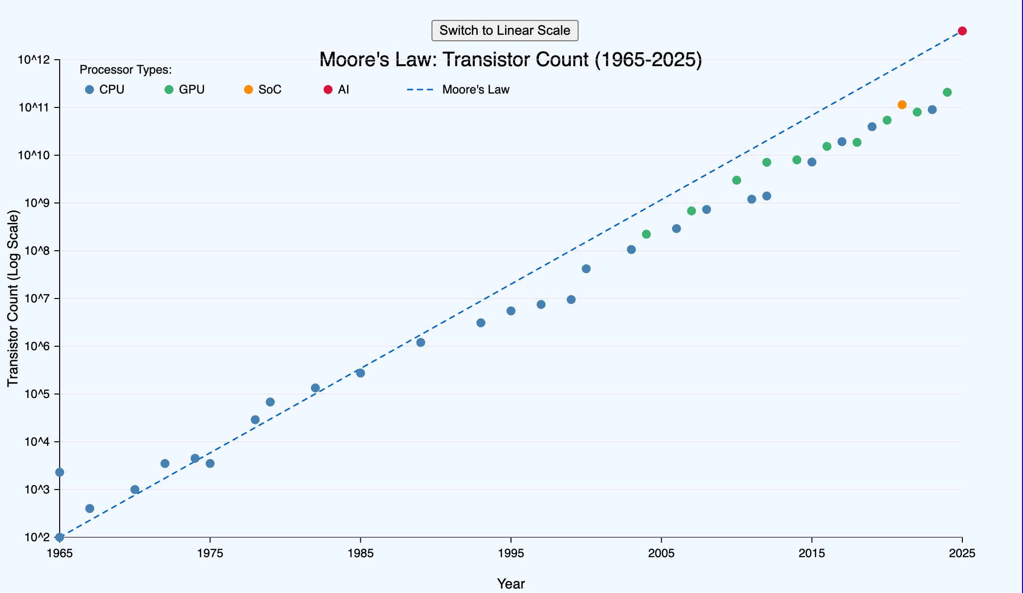
Interactive infographic showing transistor growth with linear and log scale views.
-
Neural Network Learning Pathway
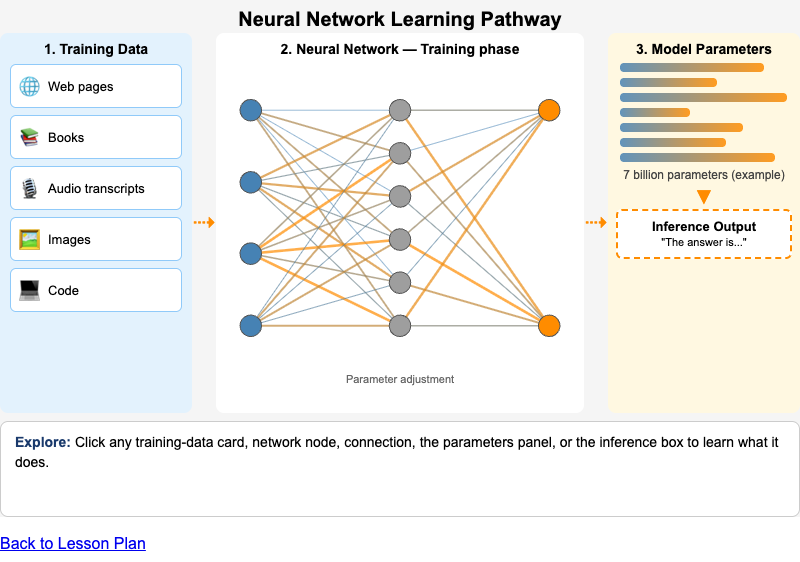
Interactive diagram showing how training data flows through a neural network to produce model parameters, which are then used for inference.
-
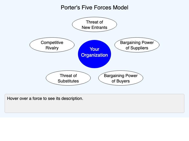
Interactive visualization of Porter's Five Forces competitive analysis framework.
-
Portfolio Balance — The Quick Win / Strategic Bet Matrix
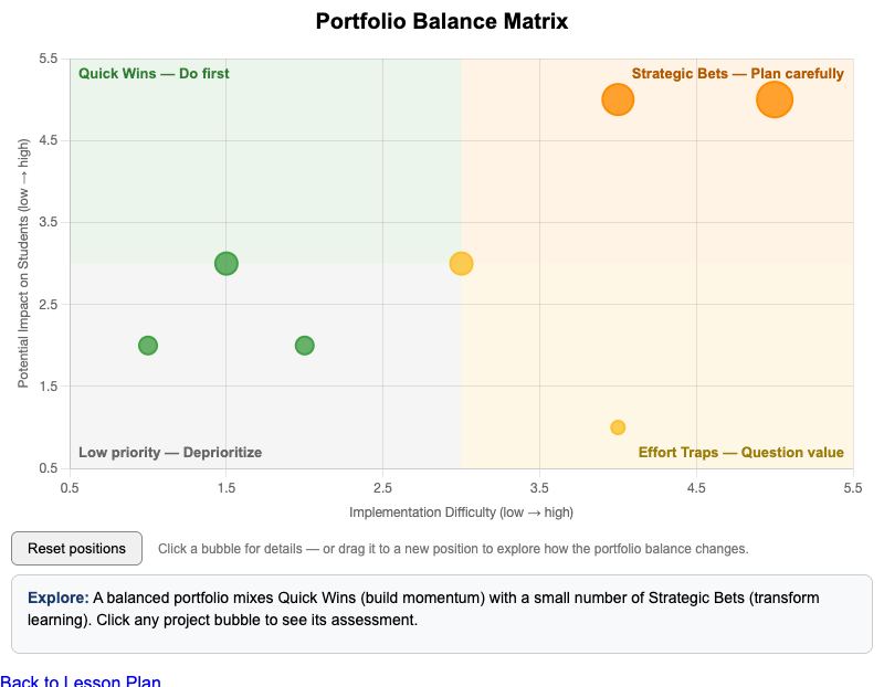
Interactive Chart.js matrix for positioning candidate AI projects across the quick-win / strategic-bet quadrants and judging portfolio balance.
-
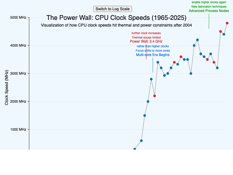
Interactive visualization showing CPU clock speed evolution and the Power Wall phenomenon.
-
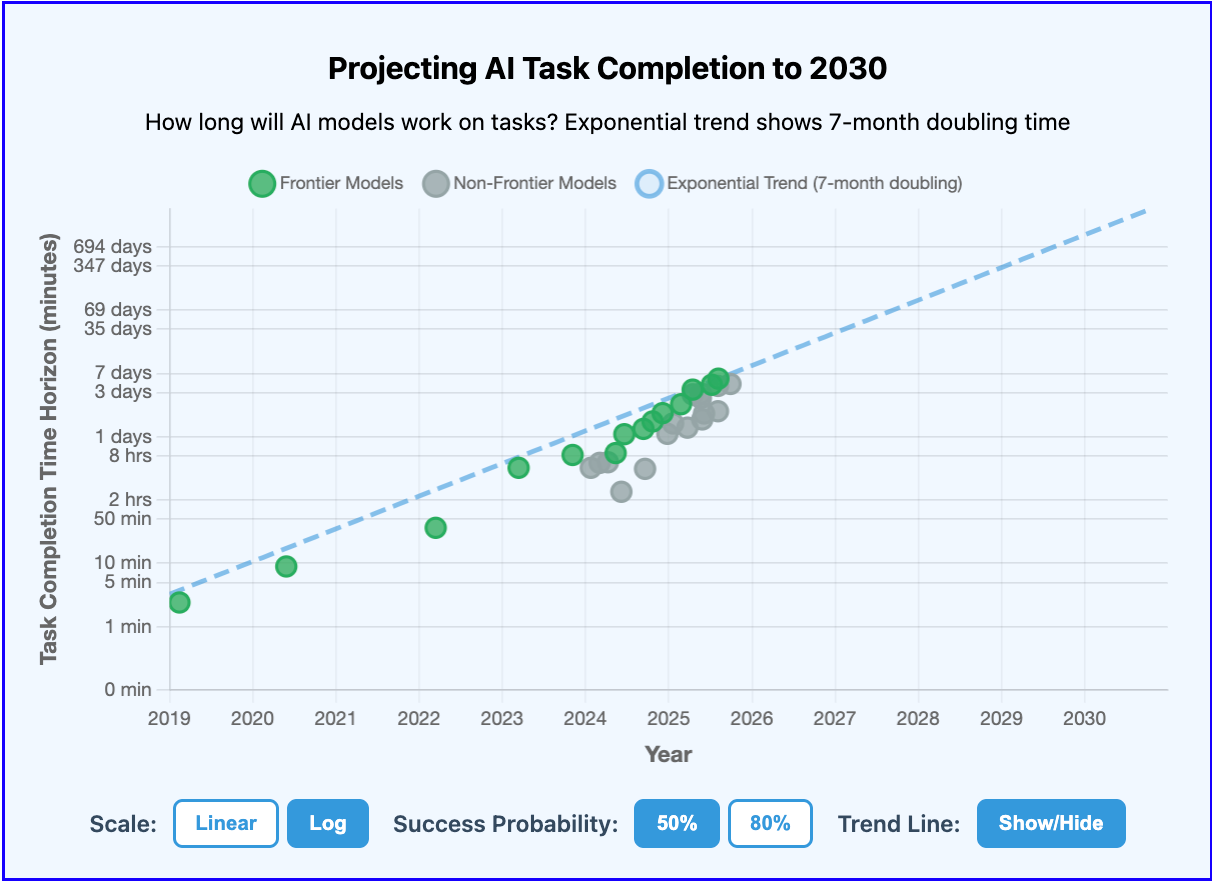
Interactive visualization showing exponential growth of AI task completion capabilities from 2019 to 2030.
-
Public vs. Private Knowledge Boundary
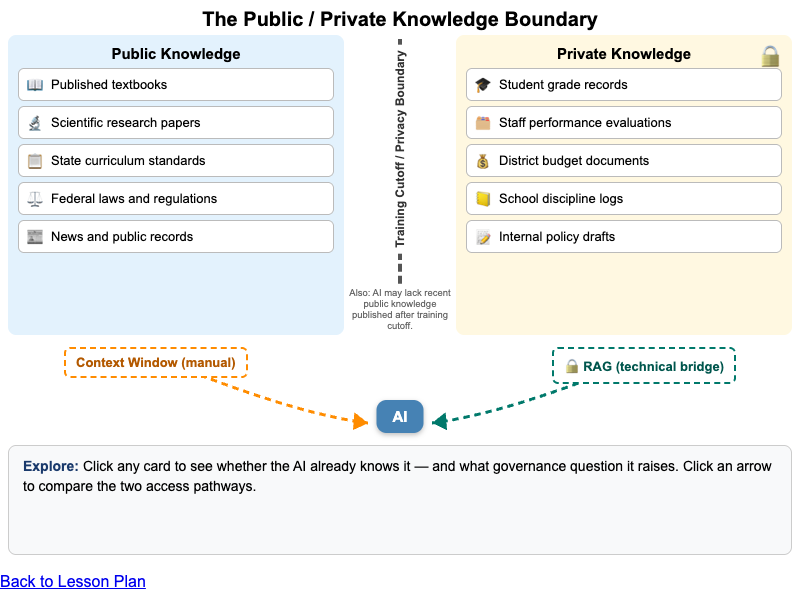
Interactive vis-network diagram of the boundary between public LLM knowledge and private institutional knowledge, and how RAG bridges the two.
-
Sample Concept Learning Graph — Fractions
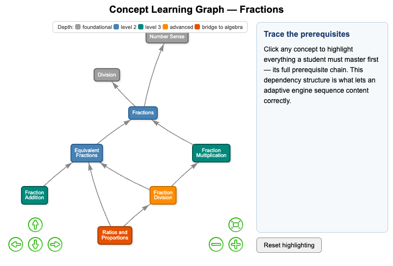
Interactive vis-network learning graph for fractions showing prerequisite dependencies and why concept ordering matters for adaptive content sequencing.
-
Sources of Algorithmic Bias in Education AI
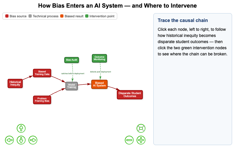
Interactive vis-network diagram tracing how historical bias enters AI training data, propagates into biased decisions, and where interventions can break the chain.
-
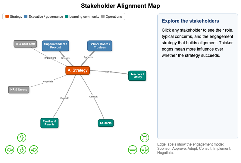
Interactive vis-network map of stakeholder groups in AI strategy adoption showing each group's role, typical concerns, and engagement strategies.
-
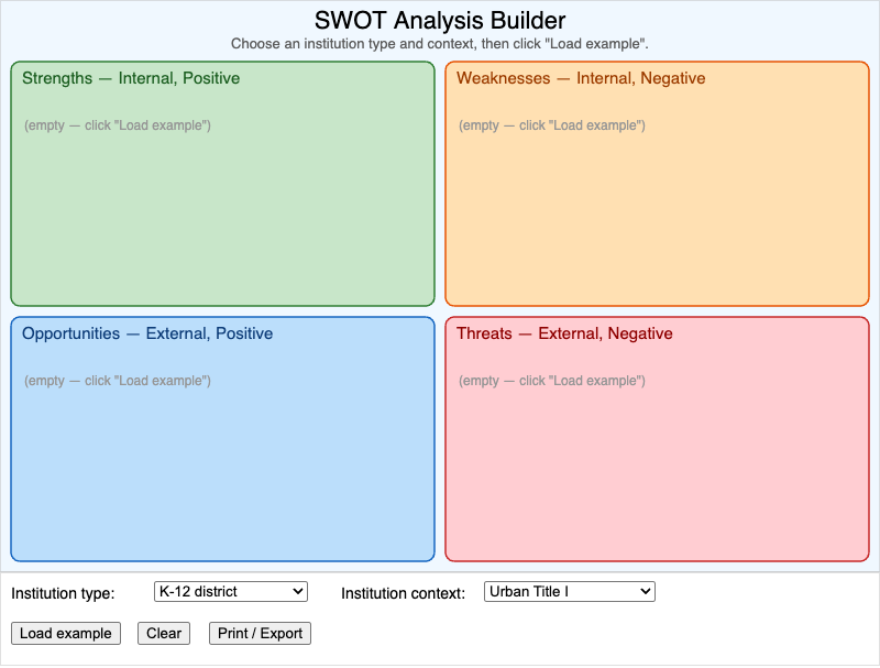
Interactive p5.js SWOT builder for generating an institution-specific analysis of strengths, weaknesses, opportunities, and threats.
-
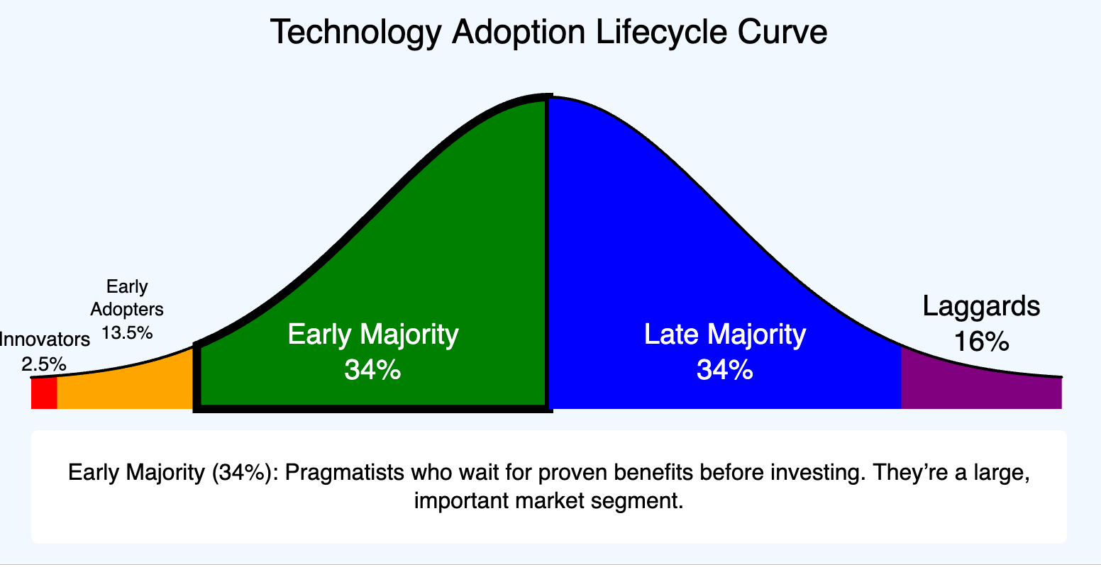
An interactive infographic visualizing the Technology Adoption Lifecycle Curve.
-
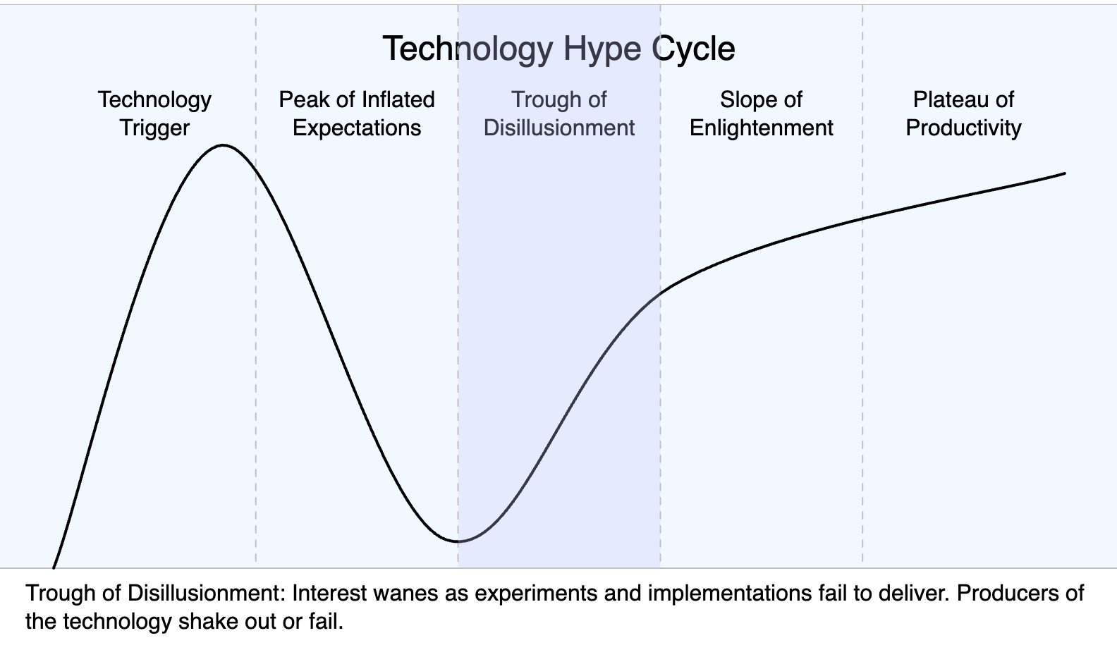
Interactive visualization of the Gartner Technology Hype Cycle phases.
-
The Adoption vs. Capability Gap
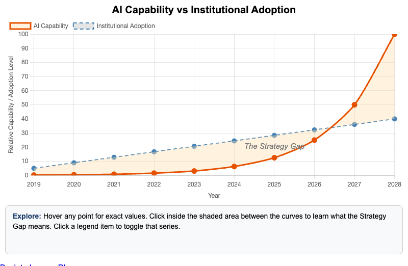
Interactive Chart.js chart showing the widening gap between accelerating AI capability and slower institutional adoption, and why deliberate strategy is needed to close it.
-
The Digital Divide in Education AI Access
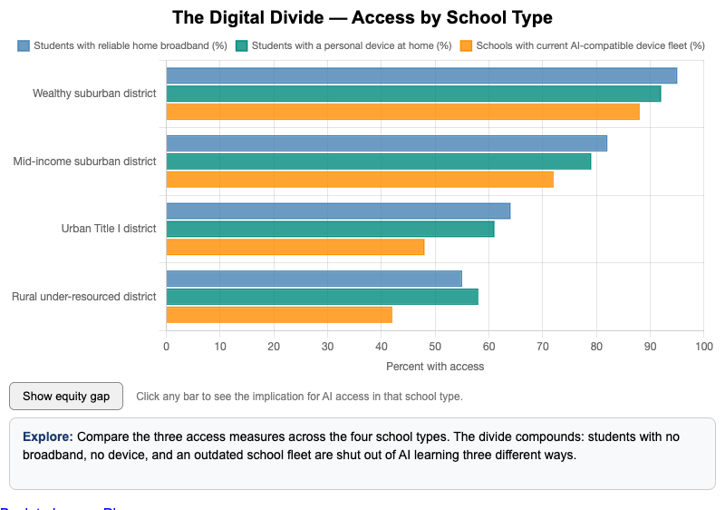
Interactive Chart.js chart of the dimensions of the digital divide in education AI access and the student populations most affected.
-
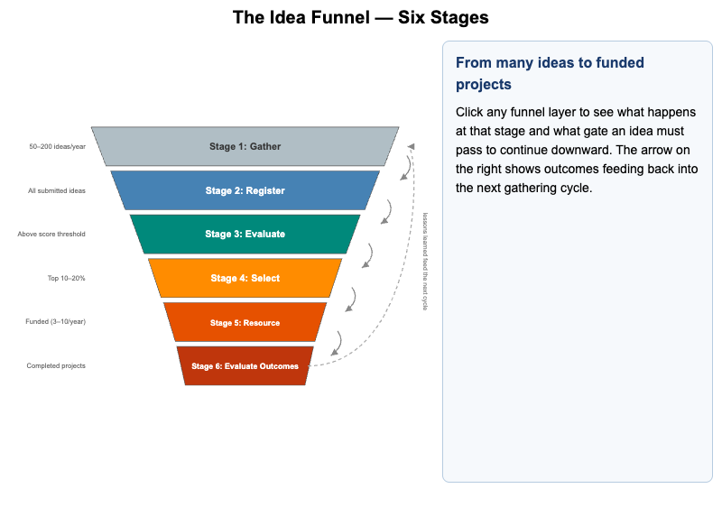
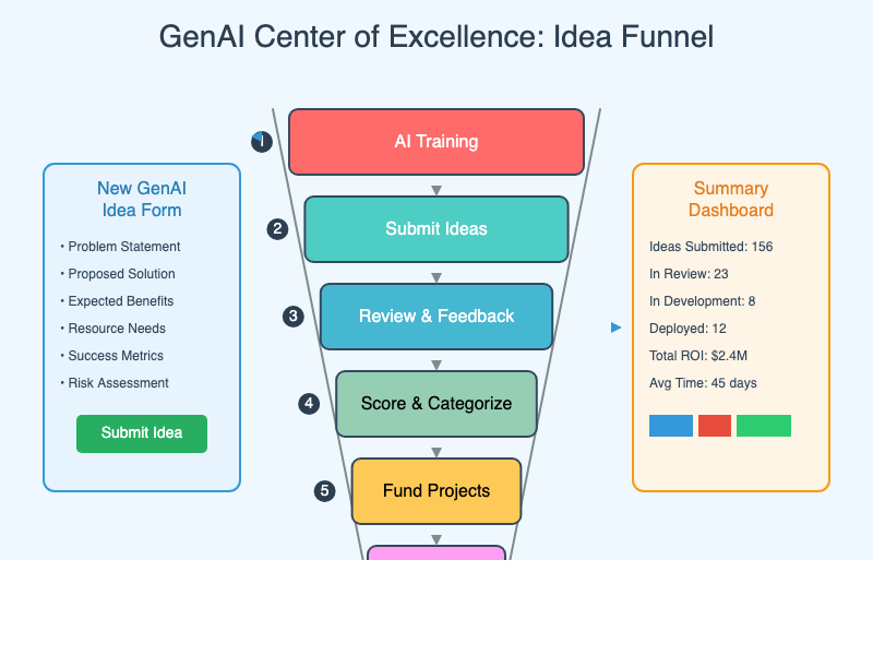
Interactive vis-network diagram tracing an idea through the six stages of the GenAI idea funnel and what happens at each gate.
-
The Institutional Agent Workforce
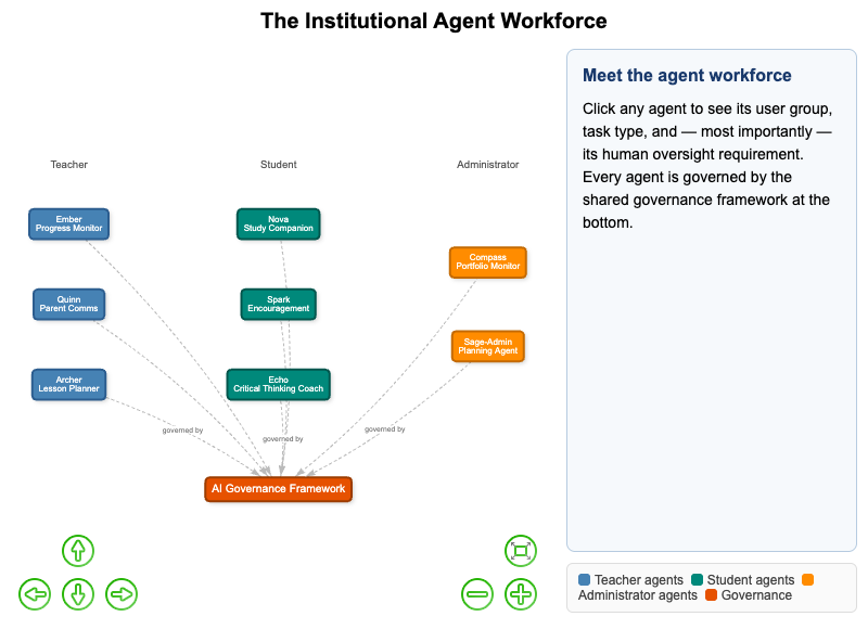
Interactive vis-network diagram of an institutional AI agent workforce showing each agent's user group, task type, and human oversight requirements.
-
The Learning Data Pipeline — From Textbook to Personalized Plan
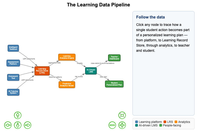
Interactive vis-network diagram tracing data from a student's learning activity through xAPI and LRS aggregation to a personalized learning plan.
-
The METR Task Horizon Timeline
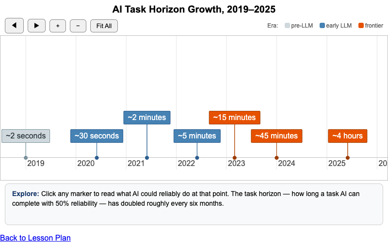
Interactive vis-timeline of METR task-horizon data points showing the pace and pattern of AI capability growth.
-
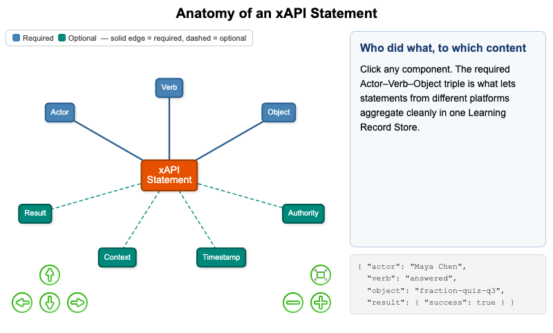
Interactive vis-network diagram of xAPI statement structure showing its required and optional components and how Actor-Verb-Object enables data aggregation.
-
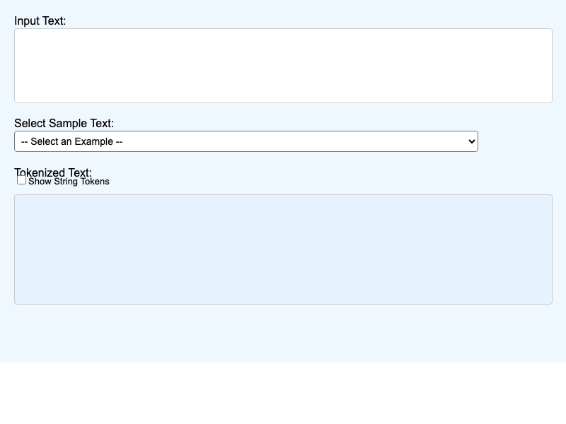
Interactive visualization demonstrating how text is tokenized for language model processing.
-
Traditional vs. Alpha School Day Structure
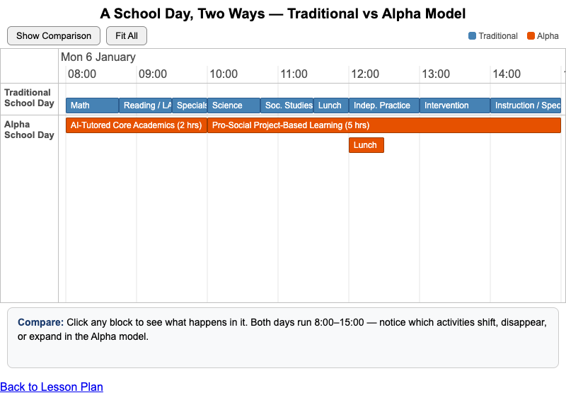
Interactive vis-timeline comparing time allocation in a traditional school day to the Alpha school model, showing which activities shift, disappear, or expand.
-
An interactive vis-network causal loop diagram of the reinforcing and balancing loops that determine whether AI tips into a single dominant player.