List of MicroSims
Interactive Micro Simulations to help students learn public health fundamentals.
-
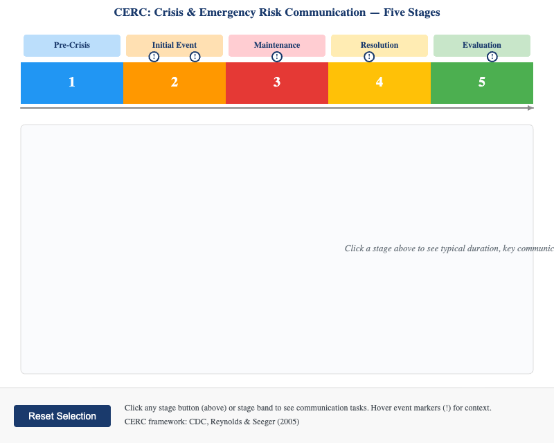
Interactive horizontal timeline of the five CERC communication stages — Pre-Crisis, Initial Event, Maintenance, Resolution, and Evaluation — with COVID-19 examples and key communication tasks for each phase.
-
Confidence Interval Coverage from Repeated Sampling
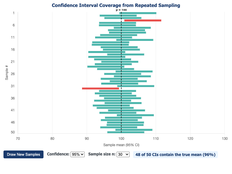
Demonstrates what "95% confidence" really means by simulating repeated sampling and showing that approximately 5% of 95% CIs fail to capture the true population mean.
-
COVID-19 Excess Mortality by Demographic Group
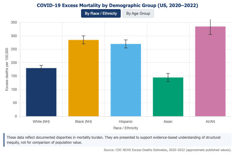
Interactive grouped bar chart showing COVID-19 excess mortality rates per 100,000 by age group and race/ethnicity, revealing stark disparities across demographic groups during 2020–2022.
-
COVID-19 Key Events Timeline 2019–2023
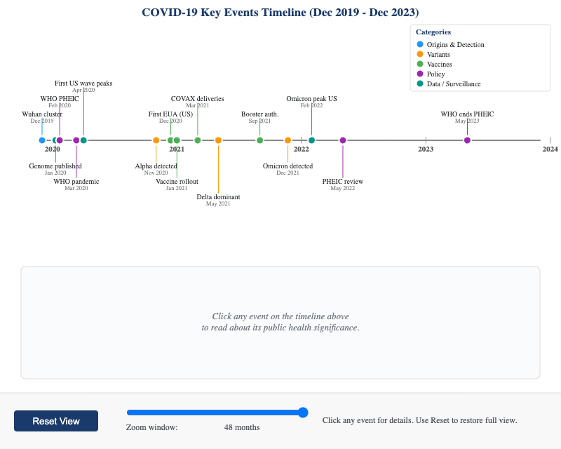
Interactive timeline of key COVID-19 events from December 2019 to December 2023, with clickable nodes organized by category — variants, vaccines, policy, and surveillance.
-
COVID-19 Systems Causal Loop Map
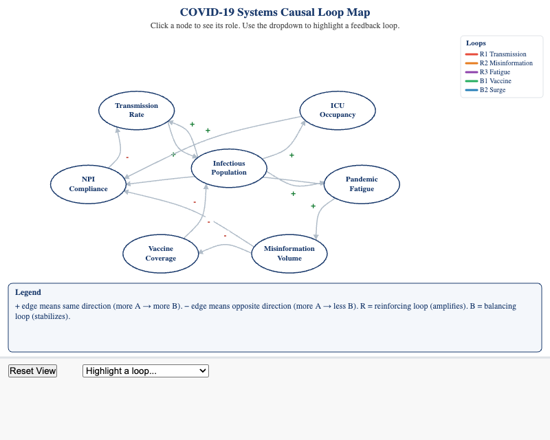
Interactive causal loop diagram of COVID-19 system dynamics, with clickable nodes and color-coded feedback loops showing how transmission, misinformation, vaccination, and policy interact.
-
DAG Variable Structures Explorer
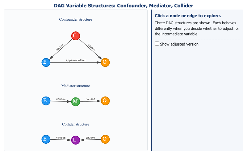
Interactive explorer of the three DAG causal structures — confounder, mediator, and collider — showing how conditioning on each affects bias and causal inference.
-
Dahlgren-Whitehead Rainbow Model
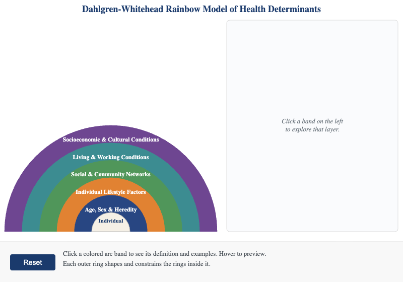
Clickable concentric arc diagram of the Dahlgren-Whitehead social determinants model, with definitions and public health examples for each layer from individual biology to the socioeconomic environment.
-
Determinants of Health — Concentric Layers
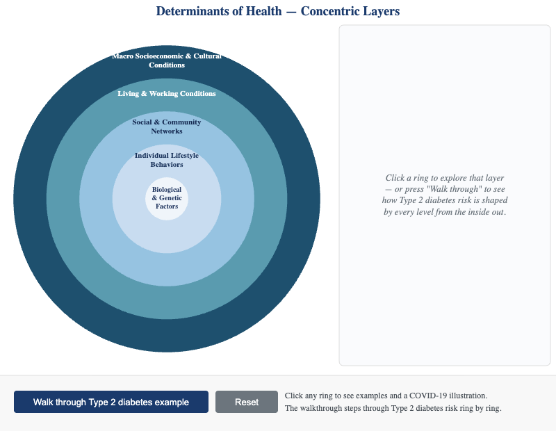
Interactive concentric-layer diagram showing how outer-ring social and environmental determinants constrain and shape inner-ring individual choices and biological outcomes.
-
Eight Archetypes Reference Card
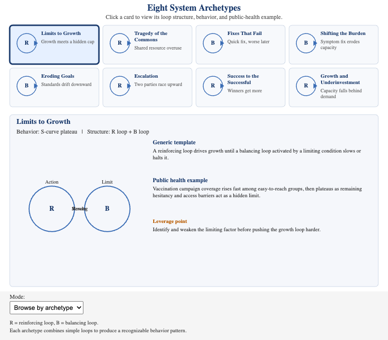
Clickable 2×4 grid of the eight systems thinking archetypes, with loop diagrams, characteristic behavior-over-time patterns, and public health intervention examples for each.
-
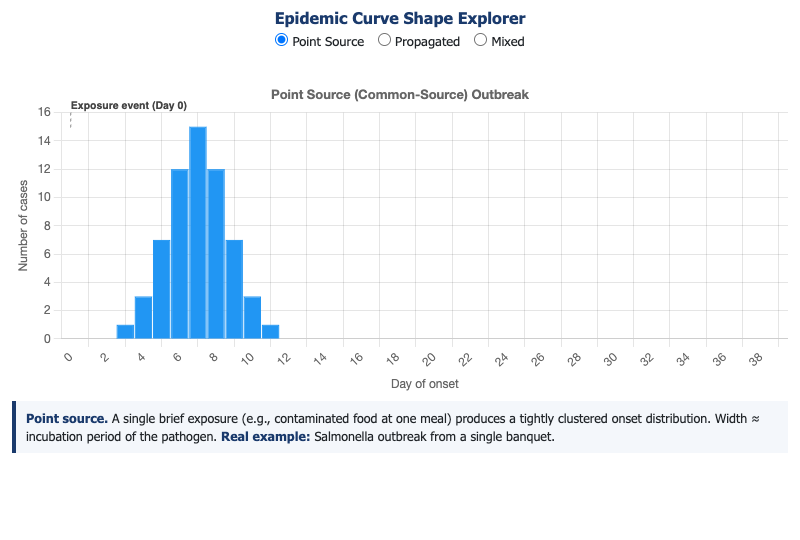
Identify and interpret epidemic curve shapes to distinguish common-source point-exposure outbreaks from propagated person-to-person outbreaks.
-
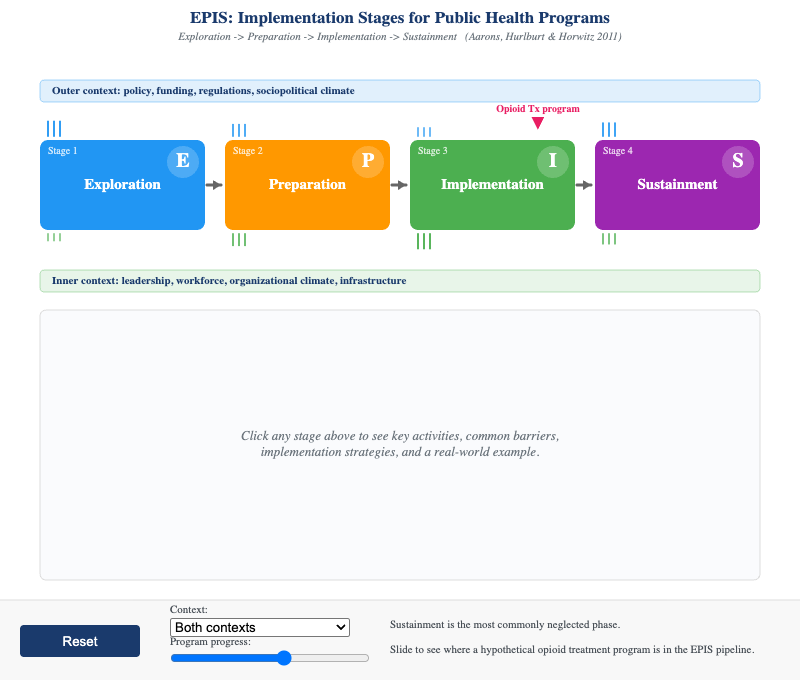
Interactive workflow diagram of the four EPIS implementation stages — Exploration, Preparation, Implementation, and Sustainment — with real-world public health examples and common barriers at each phase.
-
Four-Step Risk Assessment Framework
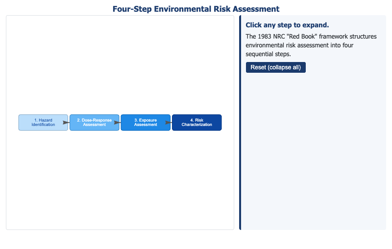
Interactive directed graph of the EPA four-step risk assessment framework — Hazard Identification, Dose-Response, Exposure Assessment, and Risk Characterization — with example metrics for each step.
-
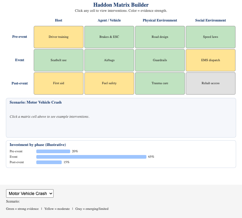
Interactive 3×3 Haddon Matrix for injury scenarios — select from crash, drowning, fall, firearm, or overdose, and explore evidence-rated interventions for each phase-factor combination.
-
Health Belief Model — Interactive Concept Map
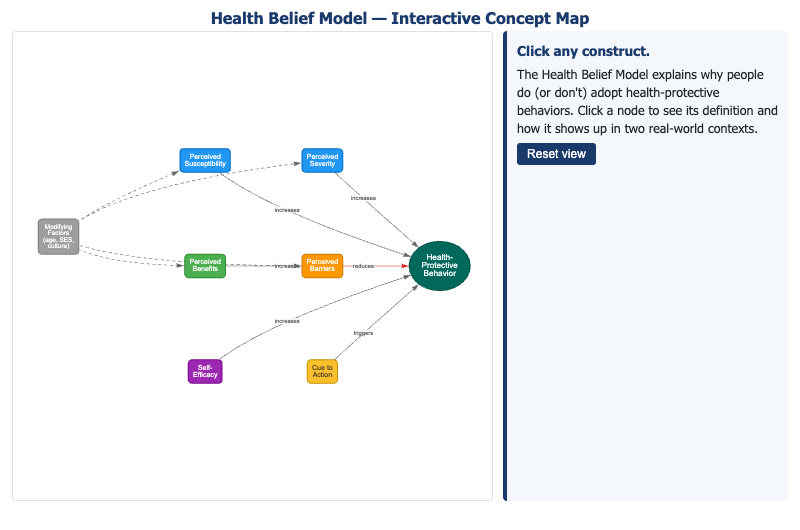
Clickable network diagram of the Health Belief Model's six constructs, with definitions and COVID-19 vaccine examples showing how perceived susceptibility, barriers, and self-efficacy interact.
-
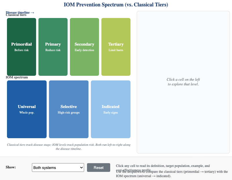
Interactive nested diagram of the IOM prevention spectrum (universal, selective, indicated) embedded within the classical prevention tiers, with a toggle to compare the two classification systems.
-
Incidence vs. Prevalence Explorer
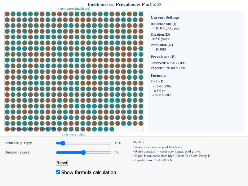
Apply the relationship between incidence rate, disease duration, and prevalence proportion by adjusting simulation parameters and observing how the prevalence pool fills and drains.
-
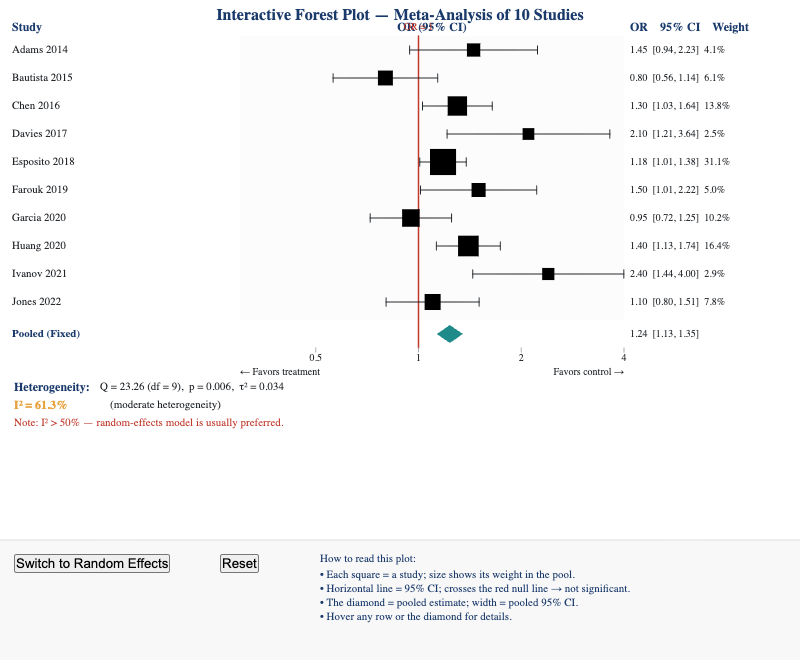
Students can read a forest plot, identify each study's contribution, recognize the pooled estimate diamond, and interpret heterogeneity statistics.
-
Interrupted Time-Series Analysis Workflow
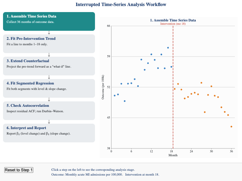
Students can describe each step of an ITS analysis, identify the four regression coefficients, and recognize threats to validity such as co-interventions and autocorrelation.
-
Kaplan-Meier Survival Curve Explorer
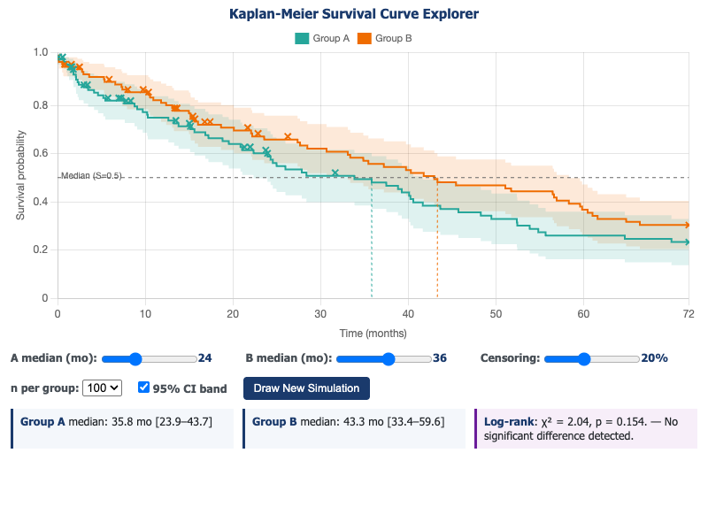
Students can interpret a Kaplan-Meier survival curve, identify median survival for each group, recognize the effect of censoring, and interpret the log-rank test comparing two groups.
-
Key Milestones in Public Health History
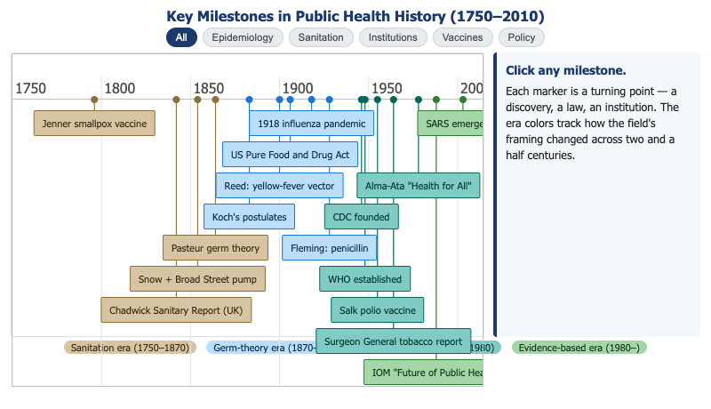
Students can identify at least six pivotal events in public health history and explain what conceptual shift or institutional development each represented.
-
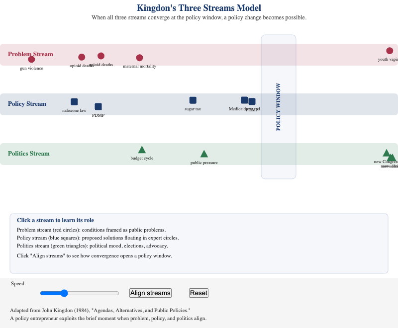
Animated visualization of Kingdon's Problem, Policy, and Politics streams where students drag streams to align at a policy window, triggering a "policy change" event when all three converge.
-
Life Expectancy and Infant Mortality by Race and Income
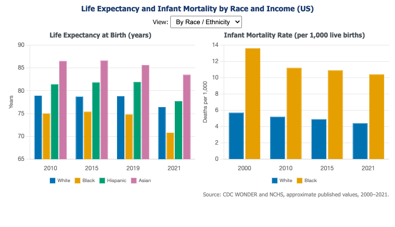
Grouped bar charts showing racial and income disparities in life expectancy and infant mortality from 2000 to 2021, with a toggle to compare by race or income quartile.
-
Meadows Leverage Points Hierarchy
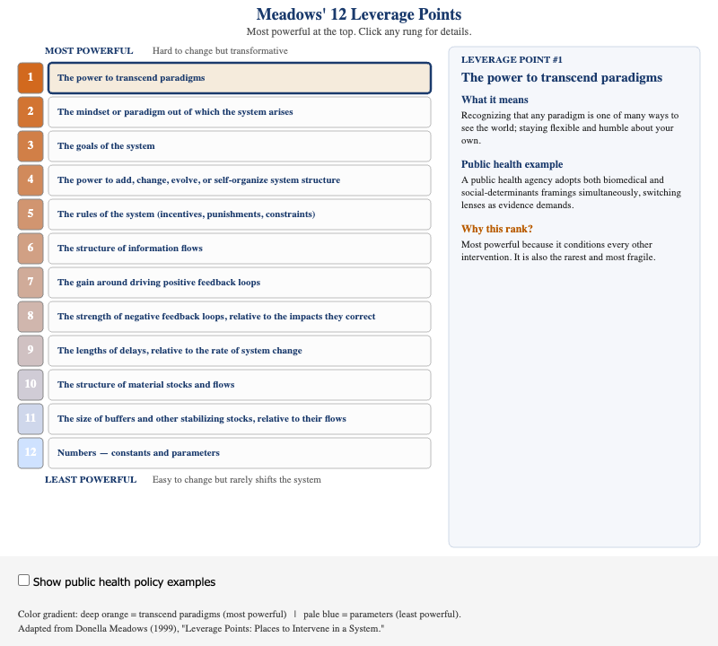
Interactive ranked list of all 12 Meadows leverage points with public health policy examples, showing why changing goals and paradigms is more powerful than adjusting system parameters.
-
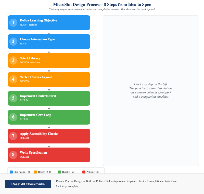
Clickable flowchart of the eight-stage MicroSim design process — from defining a single learning objective through iterative testing and deployment, with gates that prevent scope creep.
-
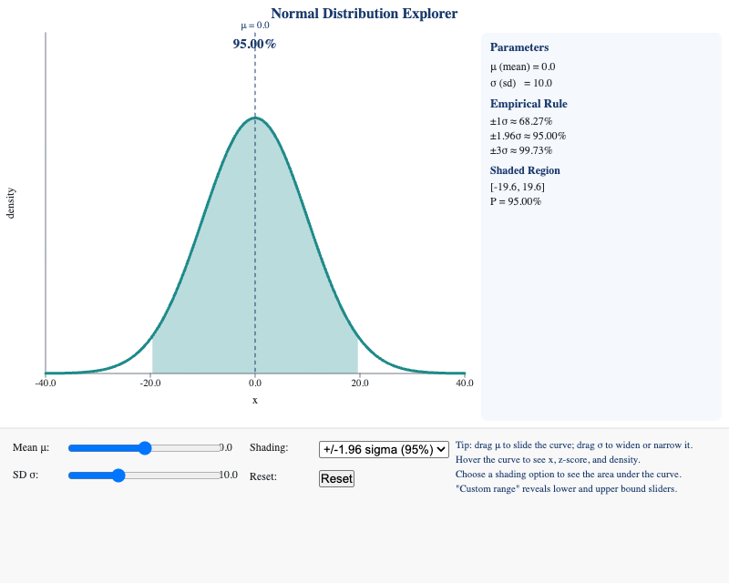
Students can explain how changing the mean and standard deviation affects a normal distribution's shape and identify what fraction of values fall within 1, 2, and 3 standard deviations.
-
Nuffield Council Ladder of Interventions
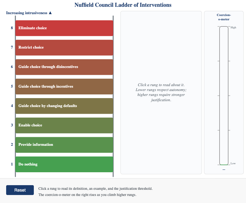
Interactive 8-rung ladder from "Do Nothing" to "Eliminate Choice," with public health examples and a coercion-o-meter showing how each rung raises the justification threshold.
-
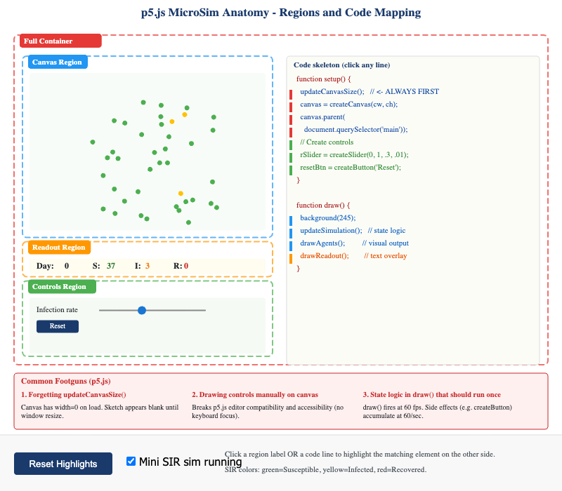
Split-panel diagram annotating the regions of a running p5.js simulation alongside the corresponding code sections, helping students understand how interactive sims are structured.
-
Pharmaceutical vs. Supplement Pre-Market Requirements
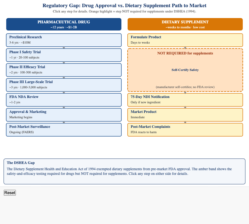
Side-by-side comparison of pharmaceutical drug approval vs. dietary supplement market entry, highlighting the regulatory steps required for drugs that are absent for supplements under DSHEA.
-
Prevention Levels Mapped to Natural History of Disease
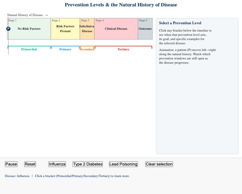
Students can explain how the four prevention levels map onto the stages of natural history of disease and identify which prevention strategy is appropriate at each stage.
-
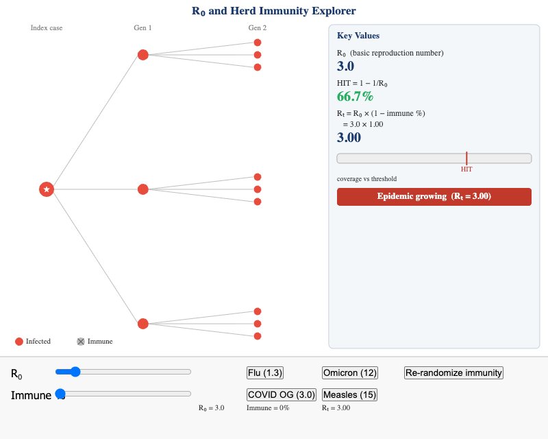
Apply the relationship between R₀ and the herd immunity threshold by adjusting R₀ values for different pathogens and calculating the required vaccination coverage.
-
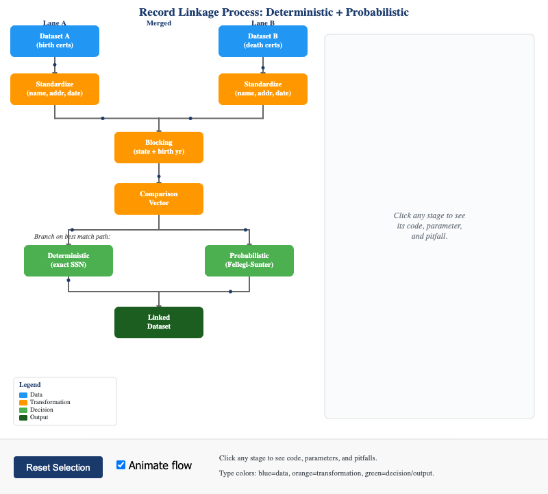
Interactive flowchart of probabilistic record linkage between two datasets — from standardization and blocking through match scoring, human review, and the final linked file.
-
Reinforcing vs. Balancing Feedback Loops
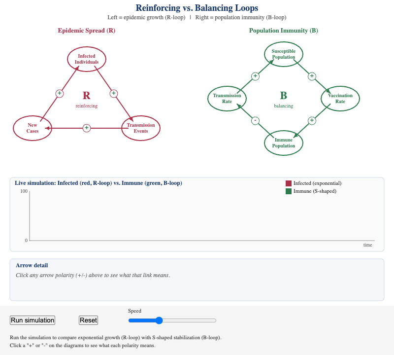
Side-by-side animated comparison of a reinforcing feedback loop (epidemic growth) and a balancing feedback loop (population immunity), illustrating why epidemic curves flatten.
-
Reproducible Research Workflow
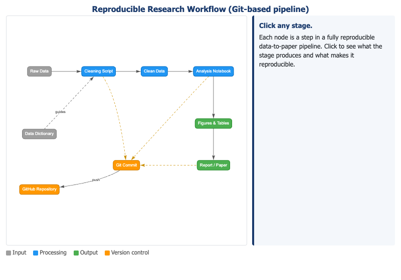
Directed graph of a Git-based reproducible research pipeline from raw data and data dictionary through analysis scripts, version control, and publication-ready outputs.
-
SIFT Applied to a Supplement Claim
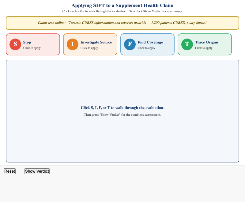
Worked SIFT walkthrough of a supplement health claim — exposing red flags in source credibility, finding independent coverage, and tracing a misleading citation back to a company-sponsored abstract.
-
SIFT Method Decision Flowchart
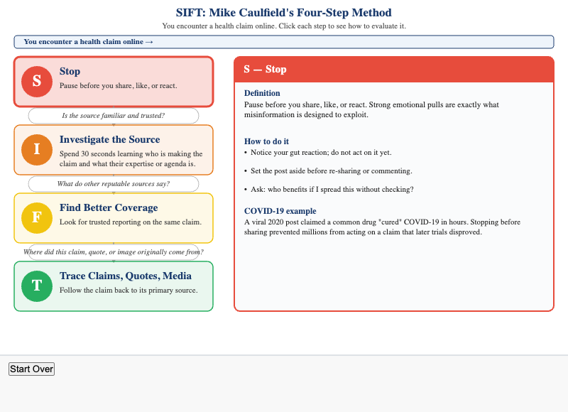
Vertical clickable flowchart of the SIFT method (Stop, Investigate Source, Find Coverage, Trace Claims) with COVID-19 misinformation worked examples at each step.
-
Screening Test Performance Calculator
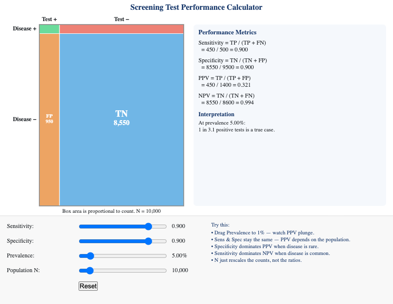
Apply sensitivity, specificity, PPV, and NPV calculations by adjusting sliders and observing how each metric changes, especially as disease prevalence varies.
-
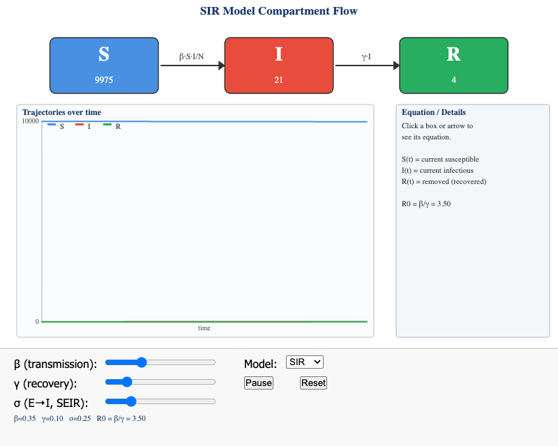
Interactive SIR/SEIR compartment diagram with clickable arrows revealing rate equations and real-time stock updates as β and γ sliders are adjusted.
-
Social-Ecological Model — Interactive Concentric Levels
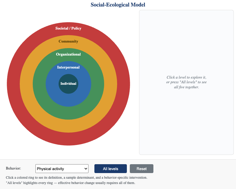
Clickable concentric-circle diagram of the Social-Ecological Model's five levels, with behavior-specific intervention examples for physical activity, healthy eating, and safe sex.
-
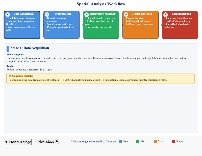
Horizontal pipeline of the five spatial analysis stages — from data acquisition and preprocessing through clustering, visualization, and interpretation — with clickable stage descriptions.
-
Study Design Evidence Hierarchy
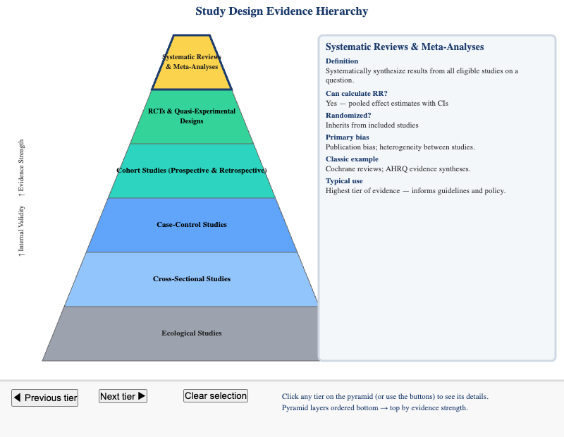
Identify and compare epidemiological study designs by their position in the evidence hierarchy, their key strengths, and their primary limitations.
-
The 10 Essential Public Health Services
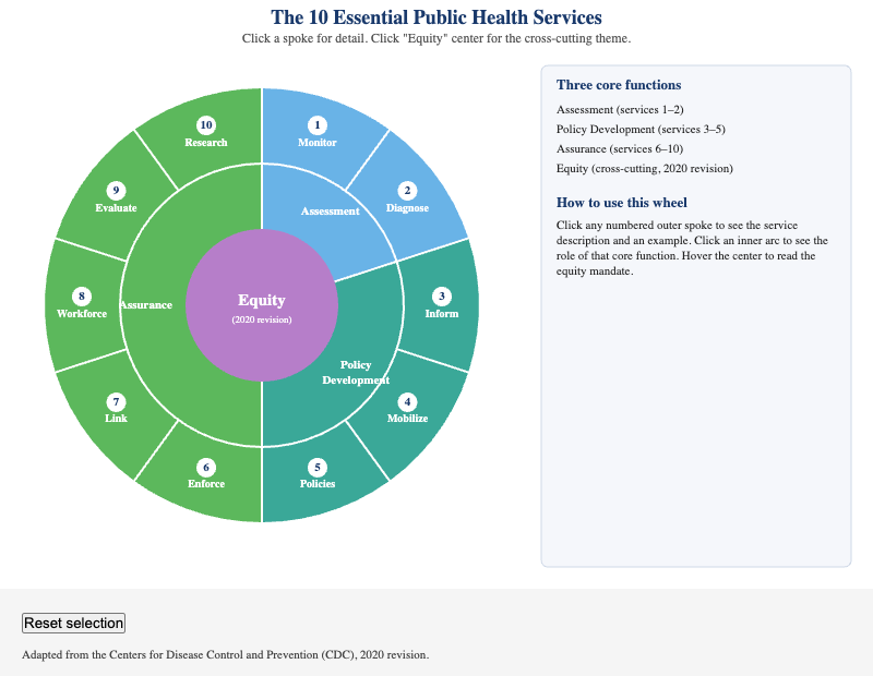
Students can identify all 10 Essential Public Health Services, assign each to its correct core function, and explain the equity mandate added in the 2020 revision.
-
Type I/II Error and Power Visualizer
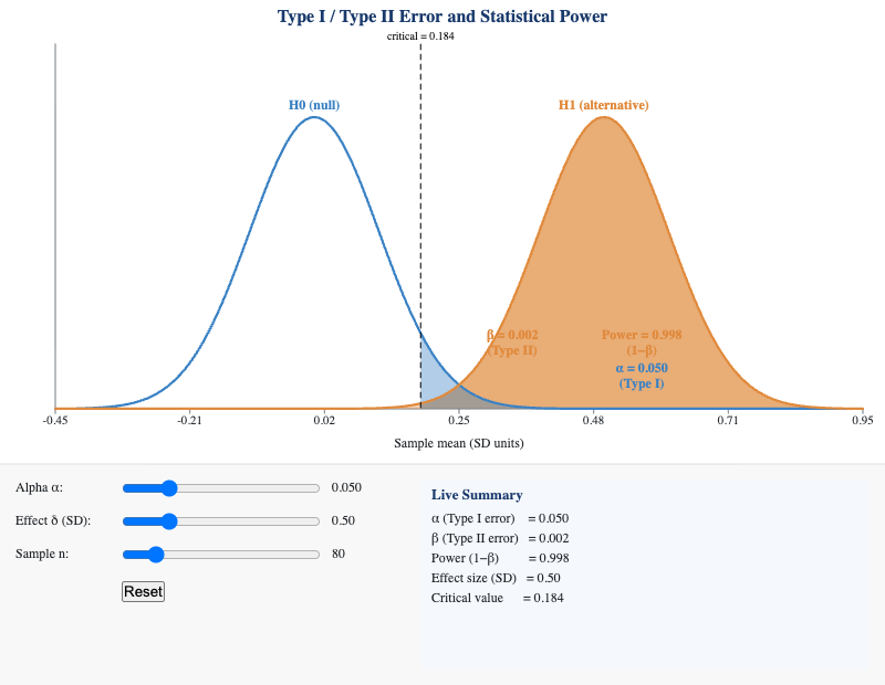
Students can explain the trade-off between Type I and Type II errors and describe how changing alpha, effect size, and sample size affect statistical power.
-
Universal Health Coverage Cube
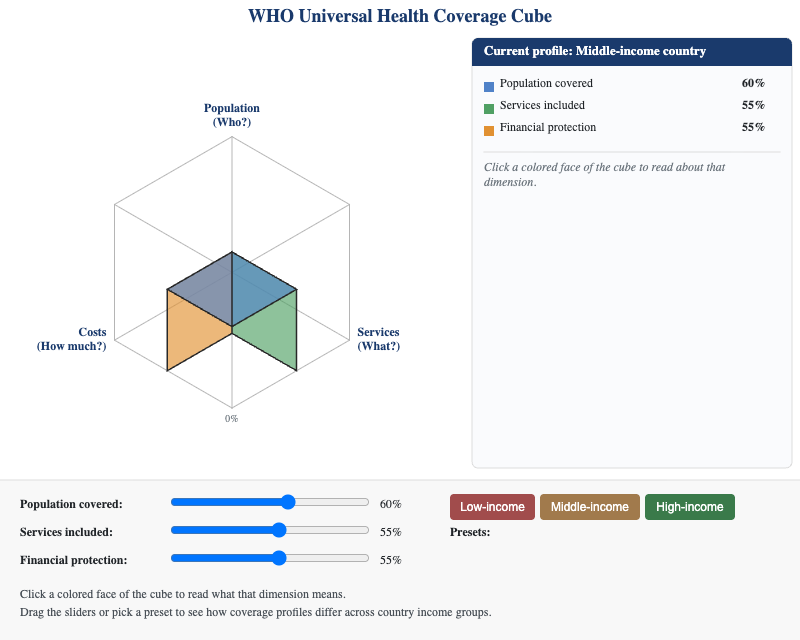
3D interactive cube representing the WHO UHC model's three dimensions — population covered, services included, and financial protection — with country-profile presets to compare coverage gaps.
-
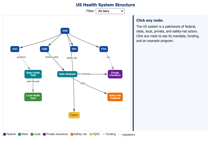
Interactive layered network diagram of the US health system — federal agencies, state/local health departments, insurers, and safety-net providers — with funding flows and regulatory authority edges.
-
Wastewater Epidemiology Pipeline
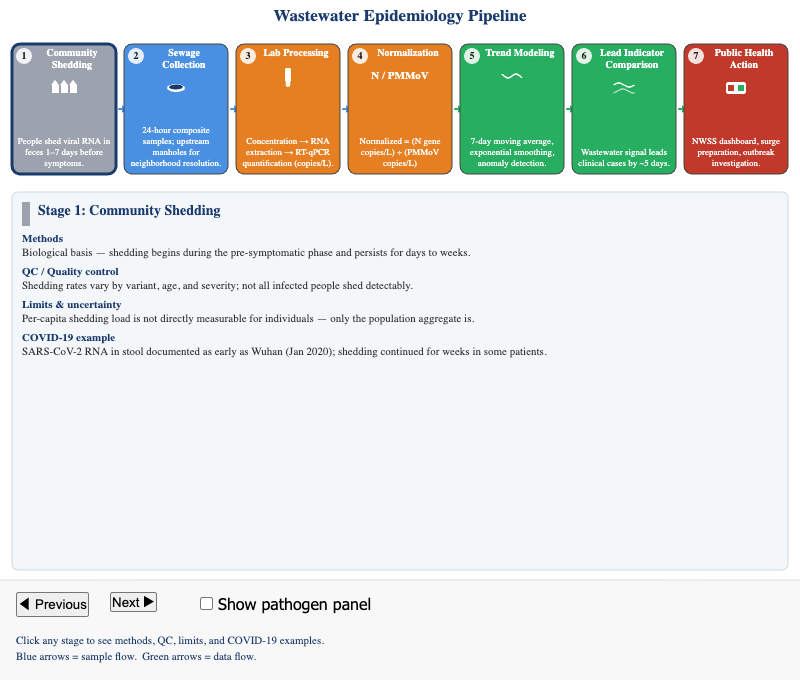
Animated seven-stage pipeline from community shedding to disease trend reporting, showing how viral RNA in sewage is collected, processed, and translated into public health surveillance signals.