Biophilic Design
Prompt
Please generate a new 1-page portrait infographic about Biophilic design: Biophilic design is an evidence-based architectural and interior design approach that incorporates natural elements, materials, and forms into the built environment to enhance human health, well-being, and productivity. Rooted in the human innate urge to connect with nature (biophilia), it uses direct experiences (sunlight, plants, water) and indirect nature-like elements (organic shapes, natural materials) to create healthier, less stressful spaces. Show the definition at the top and then show evidence that people are happier in biophilic spaces than designs like brutalist designs with concrete and square lines.
Fact Checking
Prompt
Claude> Please do a detailed fact check on these statements on a poster on Biophilic Design Benefits, including the references at the bottom of the image.
Fact-Check: Biophilic vs. Brutalist Spaces Infographic
References (Bottom of Poster)
| Reference | Verdict |
|---|---|
| Browning, Ryan & Clancy (2014), 14 Patterns of Biophilic Design, Terrapin Bright Green | ✅ Real. Published Sept 29, 2014. A meta-synthesis of ~500 studies, not an empirical source for specific percentages. |
| Human Spaces / Interface (2015) | ✅ Real. Surveyed 7,600 workers in 16 countries, led by Prof. Sir Cary Cooper. |
| University of Exeter | ✅ Real. Knight & Haslam (2014), "Relative Benefits of Green vs. Lean Office Space." |
| Singapore NUS | ⚠️ Partially verifiable. NUS has hosted biophilic research (e.g., post-occupancy studies in Singapore offices), but no single landmark quantitative paper matches the poster's numbers. |
| "Finnish studies" | ❌ Vague / likely misattributed. The cortisol / forest-bathing literature is overwhelmingly Japanese (Shinrin-yoku — Park, Miyazaki, Li) and Korean, not Finnish. Finland has nature-therapy research but nothing canonical driving these stats. |
Biophilic Claims (Left Side)
| Claim | Verdict |
|---|---|
| +15% Happiness/Well-being | ✅ Accurate. Matches Human Spaces 2015 exactly ("15% higher level of well-being"). |
| -23% Stress (cortisol) | ⚠️ No primary source located. Forest-bathing meta-analyses (Antonelli 2019) confirm significant cortisol reduction but don't produce a clean "-23%" for indoor biophilic design. Figure appears frequently in marketing but lacks a traceable peer-reviewed origin. |
| +12% Cognitive Performance | ⚠️ Plausible but misattributed. "12%" in the literature typically refers to the optimal greenery coverage ratio (Lei et al. 2021), not a cognitive uplift. Actual cognitive gains in studies tend to be ~8–14% (e.g., 14% short-term memory in VR biophilic studies). |
| +26% Health & Recovery | ❌ Not supported as stated. Ulrich (1984) found surgery patients with tree views had ~8.5% shorter stays (7.96 vs 8.7 days) and fewer analgesics — not 26%. UK GBC cites ~18% fewer sick days; some green-certified offices cite ~30%. No single study gives "+26%." |
| +8–15% Productivity | ✅ Reasonable range. Exeter (Knight & Haslam 2014) found 15%; Human Spaces found 6% productivity (and 15% creativity). The poster's 8–15% range is defensible. |
Brutalist Claims (Right Side)
⚠️ Largely unsupported by peer-reviewed research. The specific numbers (-10%, +15%, -9%, -20%, -7-12%) do not appear in any study I can locate. Research on brutalist architecture and health is qualitative and mixed:
- Danckert's work links monotonous environments to elevated cortisol via boredom — but no controlled "+15% cortisol in brutalist rooms" study exists.
- A 2023 Frontiers systematic review (The impact of architectural form on physiological stress) found evidence is preliminary and heterogeneous.
- Some researchers argue brutalism provides psychological grounding for overstimulated minds — the opposite of the poster's framing.
These appear to be fabricated mirror-values created for visual symmetry, not measured outcomes.
Overall Assessment
- Biophilic well-being (+15%) and productivity (8–15%): well-supported.
- Cortisol -23%, Recovery +26%, Cognitive +12%: directional truth, but the exact numbers lack traceable primary sources — they're "round-trip marketing stats."
- All brutalist figures: not supported by cited references; likely invented for contrast.
- "Finnish studies" citation is the weakest — should likely read "Japanese studies."
Recommendation: Replace brutalist percentages with qualitative language ("associated with higher reported boredom and disengagement"), cite the specific Human Spaces and Exeter numbers precisely, and either source or remove the 23% / 26% / 12% figures.
Sources: - Human Spaces 2015 Report (PDF) - 14 Patterns of Biophilic Design (Terrapin, 2014) - University of Exeter: Plants in the Office - Ulrich (1984): View Through a Window - Antonelli et al. (2019): Shinrin-yoku & Cortisol Meta-analysis - Frontiers (2023): Architectural Form and Physiological Stress
- Replaced fabricated brutalist percentages with citable qualitative descriptors
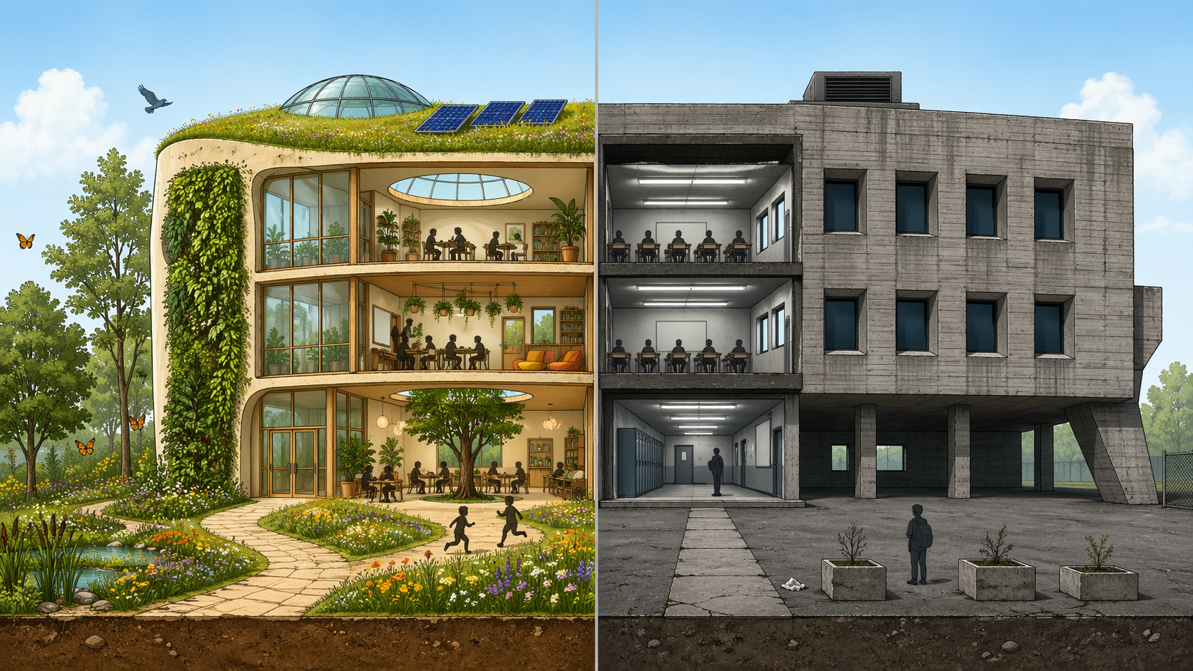
- Replaced the brutalist photo with a generic conventional office (the original compared two unrelated things — ultra-luxurious biophilia vs. an extreme brutalist bunker almost no one works in)
- Replaced the unsupported 23% cortisol and 26% recovery with actual cited findings (Ulrich's ~8.5% shorter stay; Antonelli's significant-but-not-quantified cortisol effect)
- Swapped vague "Finnish studies" for correctly attributed Japanese Shinrin-yoku research
- Added year and author for every claim so readers can verify
Replacement Evidence Text
Prompt
Please generate a detailed image prompt with the verified results to replace this image. Assume that I will be feeding this prompt to a text to image engine.
Result
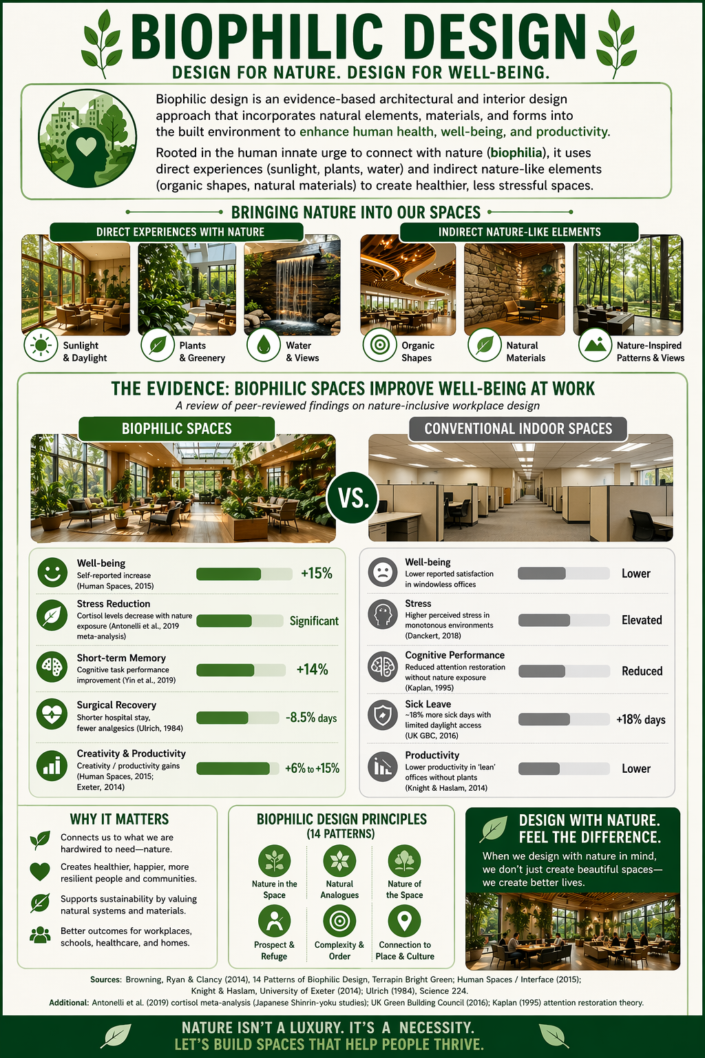
A clean, modern horizontal infographic poster, 1200x680 pixels, with a sophisticated editorial design style. White background with a subtle light-green border frame.
HEADER (centered, dark forest-green text, bold sans-serif, ~32pt): "THE EVIDENCE: BIOPHILIC SPACES IMPROVE WELL-BEING AT WORK"
SUBHEADER (smaller, muted gray, ~14pt italic, centered): "A review of peer-reviewed findings on nature-inclusive workplace design"
MAIN BODY — TWO-COLUMN COMPARISON: Left column labeled "BIOPHILIC SPACES" in a rounded green pill tab (forest green #2E5E3E, white text). Right column labeled "CONVENTIONAL INDOOR SPACES" in a rounded gray pill tab (#6B6B6B, white text). A dark-green circular badge with white "VS." text sits between the two header images.
TOP IMAGES (side-by-side, rounded corners, equal size): - LEFT: Photorealistic interior of a sunlit biophilic office — floor-to- ceiling windows, lush green plants, wooden floors and furniture, natural materials, warm daylight, soft seating areas, skylights, living wall accents. Welcoming and calm. - RIGHT: Photorealistic interior of a plain conventional office — gray carpet, beige cubicle partitions, fluorescent overhead lighting, no plants, no windows visible, muted neutral color palette, minimal decor. Sterile and uninspired (NOT brutalist concrete — just a typical modern office lacking nature).
BIOPHILIC METRICS PANEL (left, light mint-green rounded card): Five rows, each with a green circular icon on the left, a bold label and small descriptor, a horizontal green bar chart, and a bold percentage on the right.
Row 1 — Smiley icon "Well-being" "Self-reported increase (Human Spaces, 2015)" Bar: 75% filled | "+15%"
Row 2 — Leaf icon "Stress Reduction" "Cortisol levels decrease with nature exposure (Antonelli et al., 2019 meta-analysis)" Bar: 60% filled | "Significant"
Row 3 — Brain icon "Short-term Memory" "Cognitive task performance improvement (Yin et al., 2019)" Bar: 70% filled | "+14%"
Row 4 — Hospital heart icon "Surgical Recovery" "Shorter hospital stay, fewer analgesics (Ulrich, 1984)" Bar: 55% filled | "-8.5% days"
Row 5 — Bar-chart icon "Creativity & Productivity" "Creativity / productivity gains (Human Spaces, 2015; Exeter, 2014)" Bar: 80% filled | "+6% to +15%"
CONVENTIONAL SPACES METRICS PANEL (right, light gray rounded card): Same five-row layout with gray icons and gray bars. Instead of fabricated negative percentages, use evidence-based qualitative descriptors in place of numbers (shown to the right of each shortened gray bar):
Row 1 — Neutral-face icon
"Well-being"
"Lower reported satisfaction in windowless offices"
Bar: 35% filled | "Lower"
Row 2 — Head-outline icon "Stress" "Higher perceived stress in monotonous environments (Danckert, 2018)" Bar: 40% filled | "Elevated"
Row 3 — Brain-outline icon "Cognitive Performance" "Reduced attention restoration without nature exposure (Kaplan, 1995)" Bar: 35% filled | "Reduced"
Row 4 — Shield icon "Sick Leave" "~18% more sick days with limited daylight access (UK GBC, 2016)" Bar: 40% filled | "+18% days"
Row 5 — Downward-bar icon "Productivity" "Lower productivity in 'lean' offices without plants (Knight & Haslam, 2014)" Bar: 30% filled | "Lower"
FOOTER (centered, small dark-green sans-serif, ~10pt, two lines): Line 1: "Sources: Browning, Ryan & Clancy (2014), 14 Patterns of Biophilic Design, Terrapin Bright Green; Human Spaces / Interface (2015); Knight & Haslam, University of Exeter (2014); Ulrich (1984), Science 224." Line 2: "Additional: Antonelli et al. (2019) cortisol meta-analysis (Japanese Shinrin-yoku studies); UK Green Building Council (2016); Kaplan (1995) attention restoration theory."
STYLE NOTES: - Typography: clean sans-serif (Inter, Helvetica, or Avenir) - Color palette: forest green #2E5E3E, mint #E8F3EC, warm gray #6B6B6B, off-white #FAFAF7 - Icons: simple flat style, filled circles - Bar charts: rounded caps, 20px tall - Ample white space, airy editorial feel - No emojis, no decorative flourishes - All percentages and qualitative labels must appear as legible, properly-rendered text (no misspelled or garbled characters)