Risk Heat Map
Run the Risk Heat Map MicroSim Fullscreen
You can include this MicroSim on your own page with the following iframe:
<iframe src="https://dmccreary.github.io/cybersecurity/sims/risk-heat-map/main.html" height="702" width="100%" scrolling="no"></iframe>
About this MicroSim
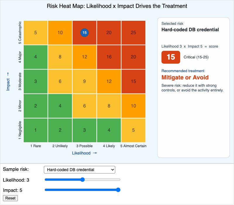
This is the 5×5 likelihood-by-impact grid that risk teams use to turn a vague worry into a number and a decision. The X-axis runs from Rare to Almost Certain; the Y-axis from Negligible to Catastrophic. Each cell shows its score (likelihood × impact) and is colored on a green → yellow → amber → red gradient. Pick a sample risk from the dropdown to auto-place the marker, nudge the likelihood and impact sliders, or simply drag the marker around the grid. Hovering a cell shows that cell's interpretation.
The right-hand panel is where the analysis lives: it shows the selected risk, the score and its band (Low 1–4, Medium 5–9, High 10–14, Critical 15–25), and the recommended treatment — Mitigate, Transfer, Accept, or Avoid — with a one-sentence rationale. Watch how the recommendation moves: a catastrophic but rare risk (quantum-broken crypto) and a likely but minor one (lost laptop) can land in very different treatment bands even though both feel "bad." That is the whole point of scoring — it stops every risk from being treated as urgent and directs scarce controls to where likelihood and impact are both high.
Lesson Plan
Learning objective (Bloom: Analyze). Given a brief risk description, students will place it on a 5×5 likelihood-by-impact grid and analyze how the recommended treatment changes with its placement.
Suggested classroom use. Hand each group a short risk scenario and have them predict the cell before placing it. Then have them drag the marker one step in each direction and note when the treatment band flips — making the boundaries between Accept, Mitigate, Transfer, and Avoid concrete.
Discussion questions:
- The "quantum-broken legacy crypto" risk is catastrophic but rare. Why might its recommended treatment differ from a moderate-likelihood, moderate-impact risk with a similar-feeling severity?
- Two risks share the same score of 12 but one is high-likelihood/low-impact and the other is low-likelihood/high-impact. Should they really get the same treatment? What does the grid miss?
- When is "Accept" the responsible, professional choice rather than negligence? What has to be true about the risk and your appetite?
References
- Risk matrix — Wikipedia
- IT risk management — Wikipedia
- Risk management — Wikipedia
- NIST SP 800-30: Guide for Conducting Risk Assessments
Specification
The full specification below is extracted from Chapter 13: "Organizational Security".
Type: microsim
sim-id: risk-heat-map
Library: p5.js
Status: Specified

A 5x5 likelihood-by-impact grid. X-axis: Likelihood (1 Rare to 5 Almost Certain).
Y-axis: Impact (1 Negligible to 5 Catastrophic). Cells colored on a
green-yellow-amber-red gradient: 1-4 green, 5-9 yellow, 10-14 amber, 15-25 red.
Per-cell scores and axis labels rendered.

Control panel: dropdown "Sample risk" (Phishing email, Hard-coded DB credential,
Vendor SaaS outage, Lost employee laptop, Quantum-broken legacy crypto, Custom),
two sliders (Likelihood 1-5, Impact 1-5), a Reset button, and an output panel
showing chosen risk, score, recommended treatment (Mitigate / Transfer / Accept /
Avoid), and a one-sentence rationale.

Behavior: selecting a sample auto-positions the marker; dragging the marker or
moving the sliders updates score and recommendation in real time; hovering a cell
shows its interpretation. Recommendation logic: score >= 15 Mitigate/Avoid;
10-14 Mitigate/Transfer; 5-9 Mitigate/Accept; <= 4 Accept.

Controls are p5.js builtins; updateCanvasSize() first; parent canvas to main.
Color: green #4caf50, yellow #fbc02d, amber #ffa000, red-orange #d84315; marker
cybersecurity blue #1565c0 with slate-steel border.

Implementation: p5.js sketch.